Design Stream isn't a general AI tool — it's been purpose-built for interior spaces, trained on materiality, light, composition, and color alongside professional designers. This guide breaks down exactly how to prompt it well: why reference imagery is non-negotiable, how your prompt should shift depending on where you are in your design workflow, and what separates a good output from a great one.
There is a particular frustration that every designer knows. You have the vision - you can feel the weight of the marble, the warmth of the light, the precise tension between a raw material and a refined one - but communicating it, whether to a client, a contractor, or a collaborator, requires a translation that something always gets lost in. Mood boards help. Sketches help. But neither puts you inside the room.
Design Stream by Mattoboard is different. Unlike general-purpose AI image tools, it has been purpose-built for interior spaces - trained specifically on the visual language of architecture, materiality, lighting, composition, and colour and pattern relationships that define great interior design. Developed in close collaboration with professional interior designers, it doesn't produce AI slop. It produces images that understand the difference between a brushed steel portal and a polished one, between ambient diffusion and gallery spot lighting, between a space that photographs and a space that lives. This guide will show you how to achieve the best editorial-style images from Design Stream.
Before we talk about words, we need to talk about images - because the single most important thing you can do when prompting Design Stream is upload reference photography alongside your text.
Here's why: written language is imprecise in ways that visual language isn't. "Warm" can mean a hundred different things. "Textured" means almost nothing on its own. But a photograph communicates color temperature, material weight, spatial mood, and compositional logic in a single frame. When you give Design Stream both a well-crafted prompt and a reference image, you are giving it two complementary inputs - the specification and the feeling - and the output reflects both.
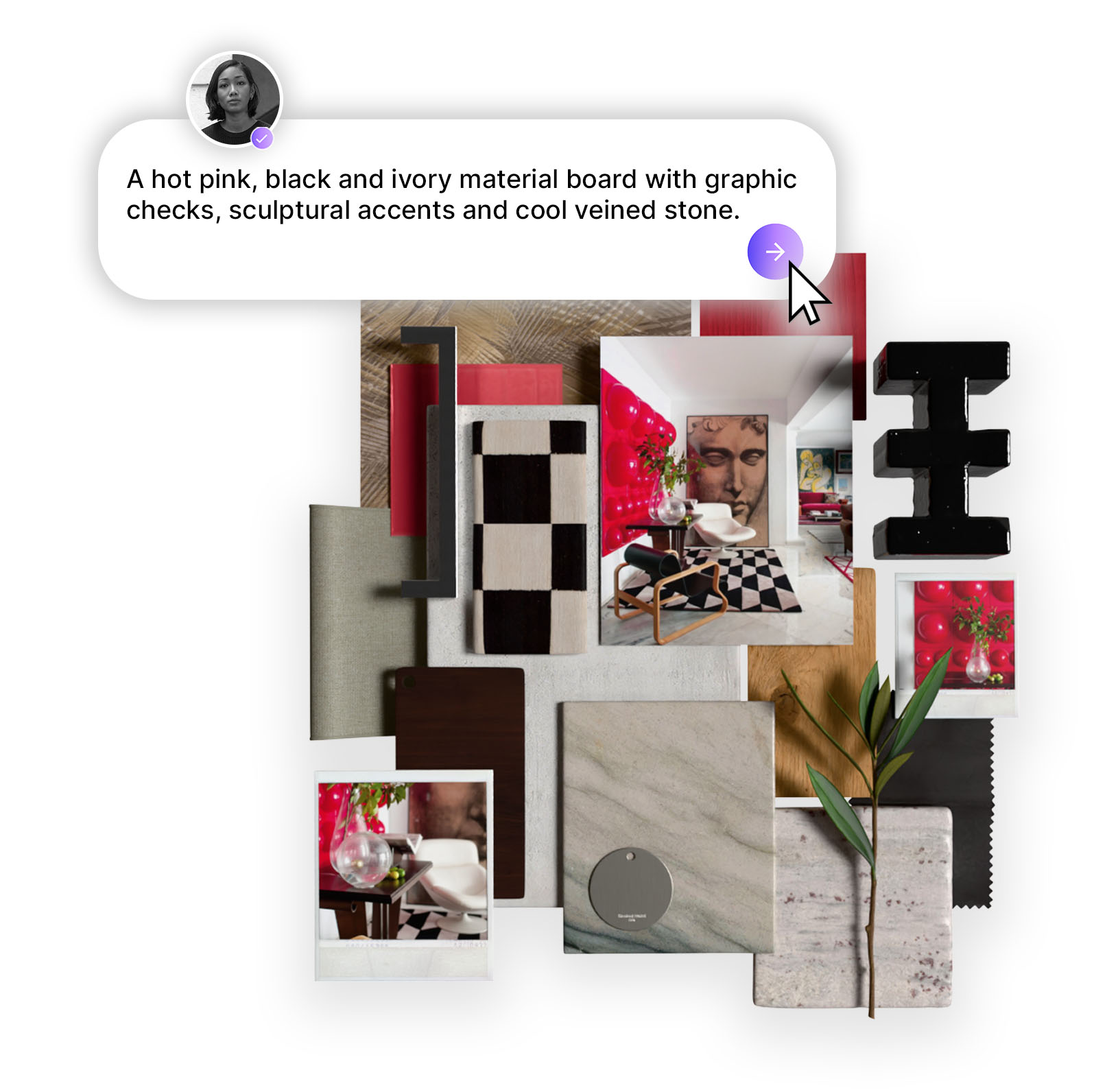
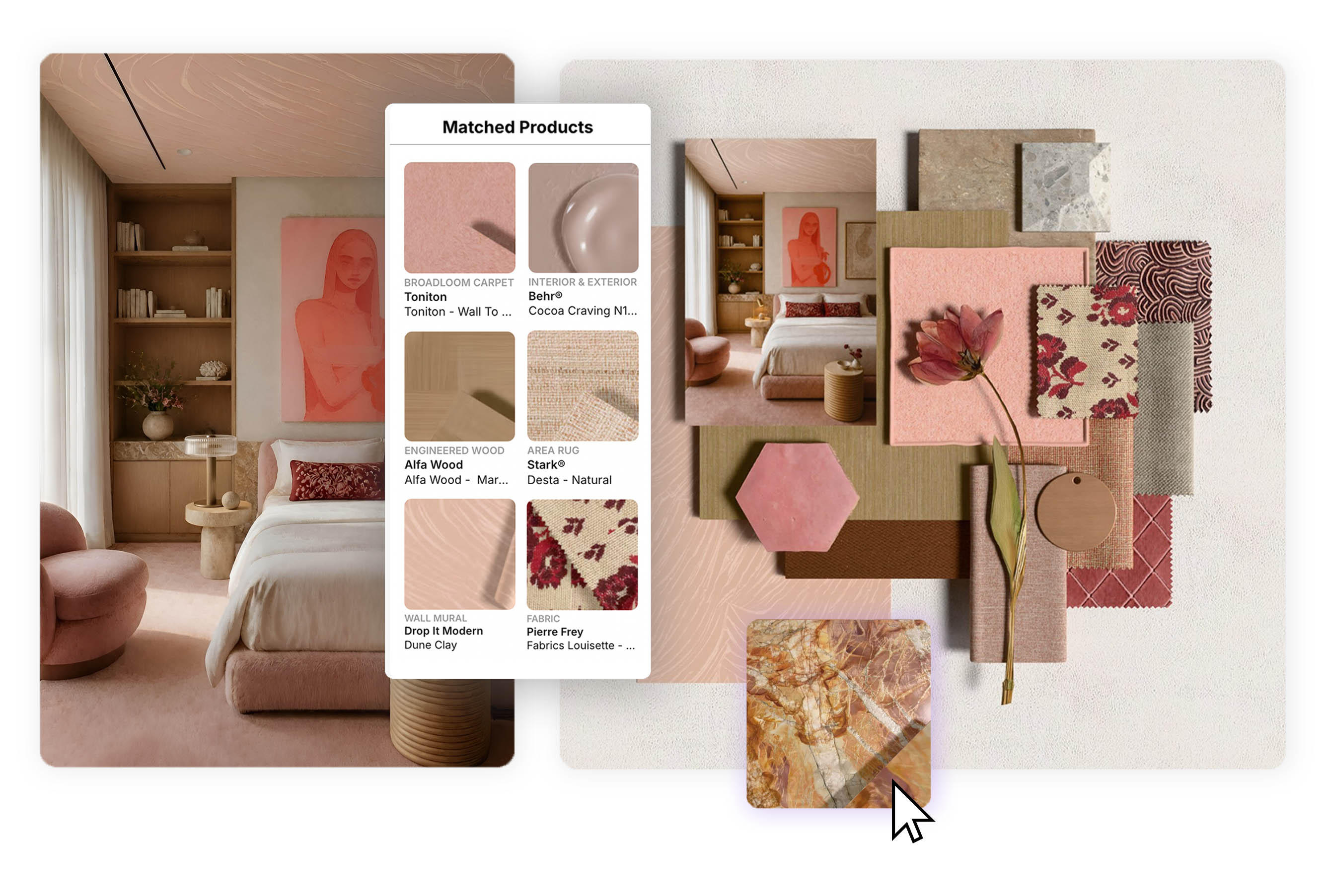
This doesn't mean you need a perfect, polished moodboard (although MattoBoard can help you create this). A saved Instagram image, a screenshot from an architect's portfolio, a product photograph — any visual reference that captures something you're drawn to is useful. Think of it less like sourcing and more like pointing: this, but also this.
The results speak for themselves. When two reference images of high-end retail interiors — each capturing different qualities of material, light, and spatial organisation — were combined with a detailed text prompt: "High-end fashion showroom featuring brushed steel portals, cream lacquer display plinths, walnut wall cabinetry, smoked glass fitting rooms, leather seating, and curated accessory displays under gallery spot lighting.
.png)
Design Stream returned a single cohesive image that synthesised those inputs into something new: a fashion showroom with brushed steel portals, sage-toned carpet, and walnut cabinetry that felt entirely resolved.
Create your own version of this space.
One of the most liberating things about Mattoboard’s Design Stream is that it doesn't demand a finished brief. It meets you wherever you are in your process - and your prompt structure should reflect that.
In the early stages of a project, before floor plans are finalised or a client brief is locked, your strongest input is atmosphere. What does this space need to feel like? What references are you drawn to?
At this stage, your prompt can be relatively loose - a space typology, a handful of material references, a mood - supported by two or three imagery references that capture the aesthetic territory you're working in. The Quilton Sofa Collection brief is a good example of this working beautifully: a simple prompt referencing the specific furniture piece by designer name ("living room following the reference images with Quilton Sofa Collection by Doshi Levien"), paired with two existing campaign images of the sofa in different settings, produced a room that felt both site-specific and editorially considered — warm timber ceiling, floor-to-ceiling glazing, and a blue-and-cream sofa configuration that read as intentional and composed.
%20(1).png)
Hot tip: At this stage, name what you know. Furniture designers and collections, material names, spatial typology, light quality, and mood words all give Design Stream meaningful anchors. You don't need to describe every element — you need to describe the ones that matter most to you.
Create your own version of this space.
Once you're working with an actual plan - even a rough one - the prompt dynamic shifts. Now you have geometry: room proportions, window placements, the relationship between zones. Upload the floor plan alongside your inspirational reference images and describe the space in relation to it. Design Stream can read spatial logic from plan drawings and translate it into three-dimensional output that respects the real constraints of the space.
%20(1).png)
Hot tip: When uploading a floor plan, be specific about what the plan shows and what you want to happen in each zone. Use the camera feature to select what area of the room you want to bring to life. Treat the plan as your architecture and the ref images as your material and atmosphere direction - they perform different roles and both matter.
Perhaps the most powerful application of Design Stream in a professional workflow is at the render stage. You have a white model - accurate in geometry, correct in proportion, but empty of warmth, materiality, or life. Rather than waiting for a full render to return from a visualiser, upload the 3D wireframe alongside a styled reference image and tell Design Stream what transformation you want.
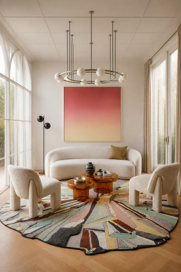
The brief for the editorial living room illustrates this precisely. A white 3D model - showing arched windows, a chandelier, and a circular sofa arrangement - was uploaded alongside a reference image of a finished, styled space, with the following instruction: bring this white 3D render to life while keeping the exact architecture, furniture layout, and camera angle unchanged. Use the material look and feel of the second uploaded reference image: soft curved furniture, warm light oak flooring, creamy upholstery, sculptural pastel rug, amber glass tables, soft daylight, and refined editorial styling.
%20(1).png)
The output kept the geometry perfectly intact — same camera angle, same proportions, same furniture positions — but the room had become a fully realised, editorially styled space with textured upholstery, a sculptural rug, and warm afternoon light. A professional visualisation, generated in seconds.
Hot tip: When working from a render or wireframe, explicitly state that you want the architecture and layout preserved. Then describe the material transformation you want using specific sensory language: texture, light quality, warmth, finish. The more precisely you describe what you're bringing in, the more faithfully Design Stream will apply it.
Create your own version of this space
Across all stages and use cases, the most effective prompts share a common structure. Think of your text prompt as having four layers:
Space and typology — what kind of room is this, and what is it for? A bedroom reads differently to a showroom; a studio flat has different spatial logic to a country house kitchen.
Architecture and layout — ceiling height, window scale, flooring, any built-in elements that define the bones of the space.
Materials and finishes — named specifically and precisely. Not "wood" but "warm walnut." Not "stone" but "honed Calacatta marble." Not "metal" but "brushed steel." Specificity is everything here.
Light and mood — quality of light (soft and diffuse, gallery spot, warm ambient, crisp northern daylight), time of day, and the emotional register of the space.
You do not need to cover every element - a prompt that tries to describe too much often produces a room that feels cluttered in its logic. Choose the details that matter most and trust Design Stream to fill in the rest with intelligence.
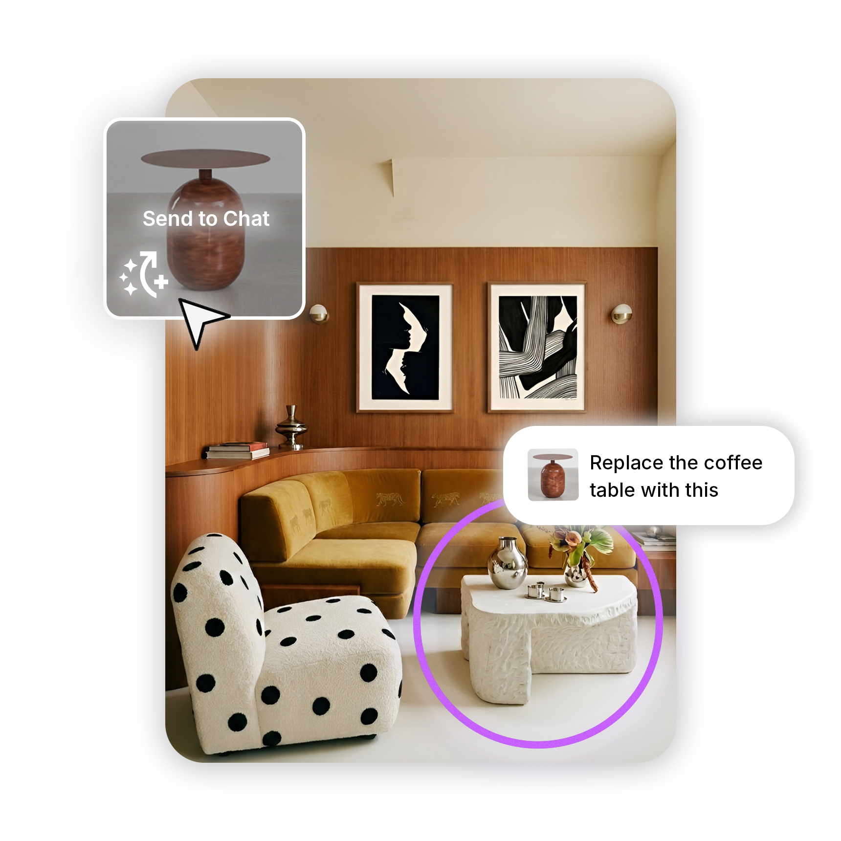
There is one further use of reference imagery that deserves its own mention, because it represents a genuinely different way of working. Rather than uploading images of spaces, you can upload individual product shots — a specific chair, a coffee table, a textile — and let Design Stream build an entire room around them.
The Parisian living room above is a perfect example. Two furniture references were uploaded: a dark sculptural oval coffee table with turned column legs, and a coral-pink low lounge chair with a distinctly graphic, almost cartoonish silhouette. Two pieces that, on paper, have no obvious reason to coexist. And yet Design Stream placed them together in a sun-filled Haussmann salon — herringbone parquet, ornate boiserie panelling, a cream bouclé sofa, a loose jute rug, an abstract canvas — and made them feel entirely intentional. The coral chair anchors the foreground; the table grounds the centre of the room. The result reads not as a collision of references but as a considered edit.
%20(1).png)
This is the most personal way to use Design Stream. You do not need to begin with a room type or a brief. You can begin with two pieces you love - perhaps a hero furniture item you're specifying for a client, perhaps a vintage find alongside a new purchase - -upload them together, describe the spatial atmosphere you want around them, and see how Design Stream resolves the conversation between them.
Happy prompting. :)
Start designing with MattoBoard.com now.