Gradients are shaping 2026 interiors with softer, more atmospheric spaces where color feels alive, shifting through light, material, and movement. From iridescent kitchens to ombré curtains and glowing vanities, the trend turns surfaces into moments of transition rather than static color.

Gradients are becoming one of 2026’s most mesmerizing interior design moves, bringing softness, movement, and emotional depth into spaces that might otherwise feel static. Rather than choosing a single flat color, designers are using transitions, from terracotta to blush, coral to cream, pearl to green, or pink to cobalt -to make surfaces feel alive and constantly changing. From glowing bathroom vanities and iridescent kitchens to ombré curtains, gradient islands, and large-scale artwork, the trend works best when light, material, and direction are carefully considered. The result is an interior that feels less fixed and more atmospheric -like a room caught in the act of becoming.
"A gradient is not a color choice. It is a time choice — a decision to show a color not as it is, but as it becomes. And in an interior, that quality of becoming is one of the most quietly extraordinary things a surface can do."
Color has always been the interior designer's most powerful tool. But in 2026, the most compelling interiors are doing something more sophisticated than simply choosing a color — they are choosing a transition. From terracotta to blush, from iridescent pearl to green, from deep coral to butter cream, the gradient has arrived in the interior with the subtlety of a sunset and the ambition of a completely new design language. These five spaces are the proof.
The gradient — the smooth, continuous transition from one color or tone to another — is one of the oldest effects in visual art. The sfumato technique pioneered by Leonardo da Vinci in the late 15th century was, at its core, a gradient: the imperceptible blending of tones across a painted surface to create the illusion of depth, atmosphere, and the quality of light passing through air. For centuries, the ability to produce a convincing gradient was one of the defining markers of painterly skill.
In the decorative arts, gradients appeared throughout history in the form of ombré dyeing — a technique used in textiles, ceramics, and glass to create the effect of one color dissolving into another. Japanese ceramicists developed extraordinary mastery of gradient glazes; European glassmakers of the Art Nouveau period produced vessels in which color shifted from base to rim in long, luminous transitions. These were gradients produced by hand, by heat, by the chemistry of glaze and dye — technically demanding, materially rich, and beautiful precisely because of the imprecision inherent in their making.
The digital revolution of the 1990s and 2000s gave the gradient a complicated reputation. As the default background of countless PowerPoint presentations, early websites, and budget graphic design, the digital gradient became associated with a particular kind of unsophisticated visual thinking — the choice of someone who wanted color but didn't know how to commit to one. The word "gradient" became, for a generation of designers, a mild pejorative.
But craft and material intelligence have a way of rehabilitating even the most digitally compromised ideas. As the 2020s brought a renewed interest in the qualities that only physical materials can produce — the irregularity of handmade tile, the depth of natural plaster, the luminosity of polished stone — designers began asking what a gradient would look like if it were produced not by a digital tool but by the hands of a maker, by the physics of light through glass, by the chemistry of lacquer on metal. The answers, as these five spaces demonstrate, are extraordinary.
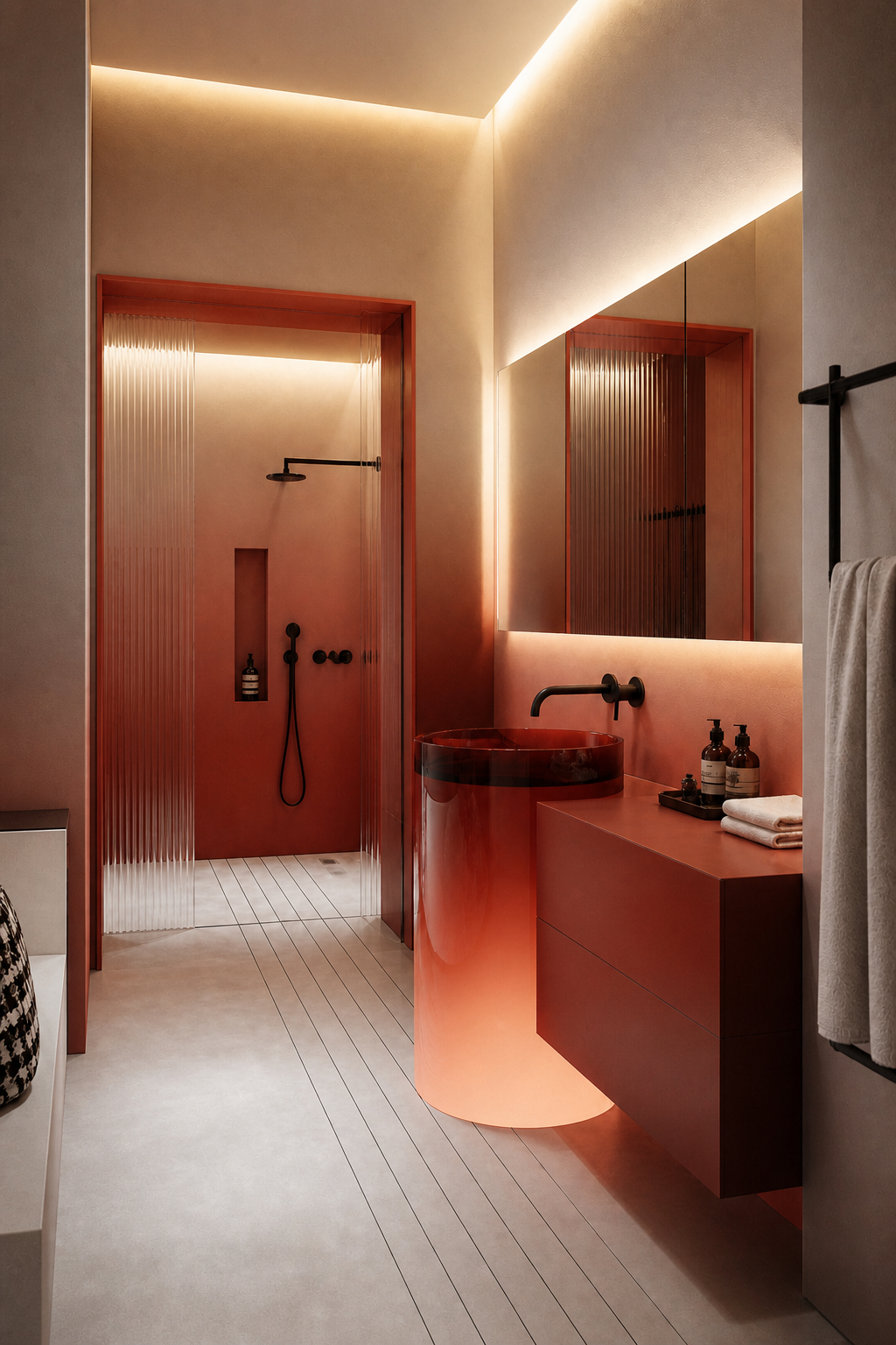
The most intimate space of the five — and the one that uses the gradient with the greatest material intelligence. A bathroom vanity unit in deep terracotta at the top fades through coral and warm orange to a pale, almost luminous blush at its base, where an internal light source within the vanity itself glows upward, amplifying the gradient's lightest tone and making the entire piece appear to be lit from within. This is not a painted gradient. It is a gradient produced through lacquer, lighting, and the precise control of material finish across a single continuous surface — and the effect is astonishing.
The warm amber strip lighting recessed into the ceiling and the mirror surround bathes the entire room in the same warm, amber-coral tones as the vanity, creating a feedback loop of gradient color that makes it impossible to say where the furniture ends and the lighting begins. The room is not lit; it is colored by light. The ribbed glass shower screen adds a final refractive element — its vertical flutes catching and scattering the warm amber light in thin vertical lines that echo the downward fade of the vanity's gradient.
This bathroom understands something fundamental about how gradients work in interior space: they are not static color effects but dynamic light effects. The gradient on the vanity changes as the day progresses, as the strip lighting dims or brightens, as steam from the shower softens the ambient light. It is a surface that is never quite the same twice — and that quality of constant, subtle change is what makes it genuinely extraordinary to live with.
Design tip: A gradient vanity unit with an internal light source at its lightest end creates a glow-from-within effect that transforms the bathroom's ambient light entirely — the furniture becomes a luminaire, and the color becomes inseparable from the light it generates.
Explore this concept and create your own.
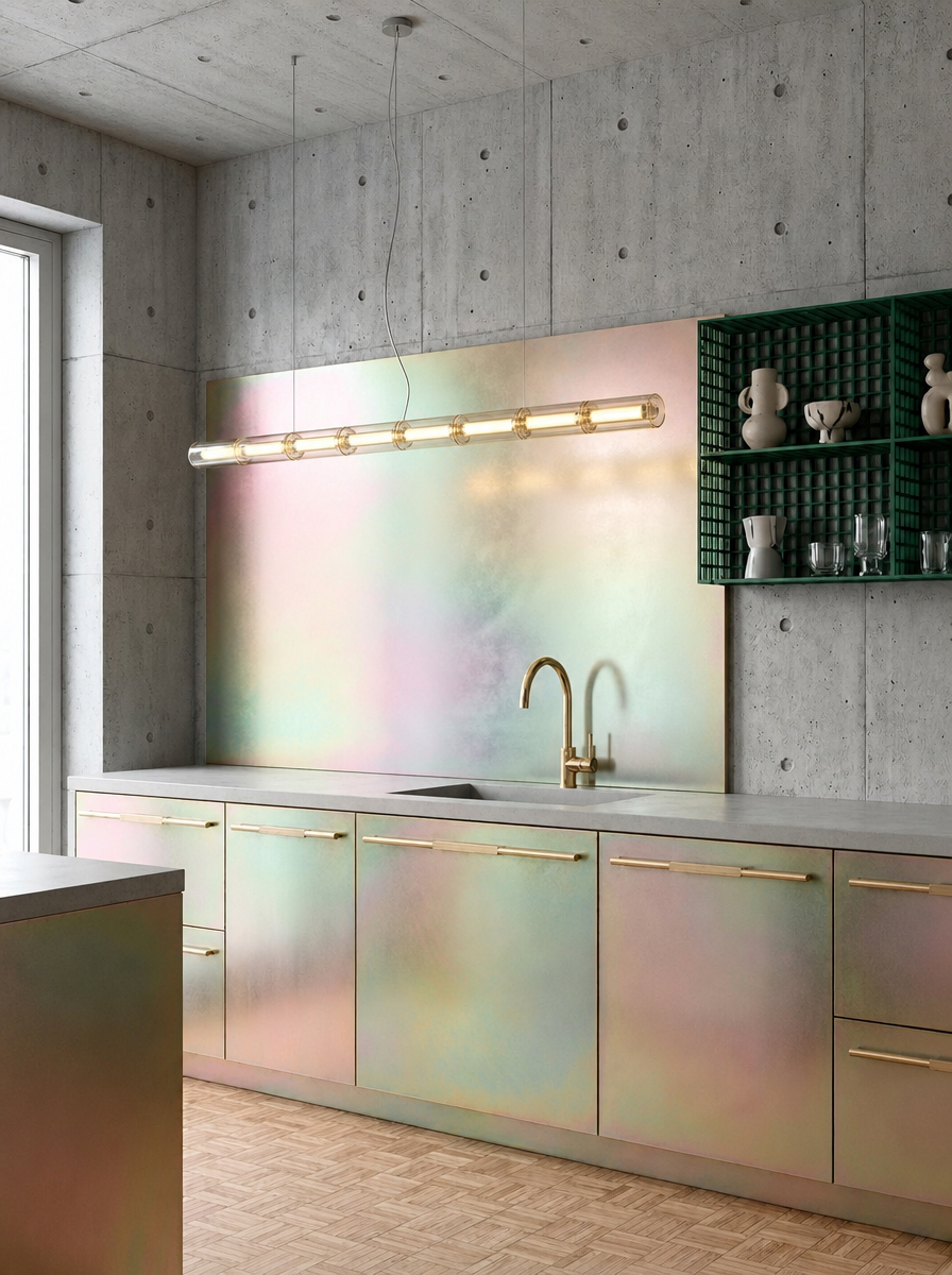
The most technically extraordinary space of the five — and the one that pushes the gradient concept furthest beyond the conventional. The kitchen cabinetry and splashback are finished in an iridescent material that shifts between pearl white, soft pink, mint green, and warm gold depending on the angle of light and the position of the viewer. This is not a gradient in the conventional sense — a fixed transition from one color to another — but something more unstable and more fascinating: a surface that contains multiple gradients simultaneously, each one visible only at a particular angle or under a particular quality of light.
Against the raw, exposed concrete ceiling and walls — with their deliberately industrial, unfinished quality — the iridescent cabinetry reads with extraordinary drama. The contrast between the rough, matte, grey concrete and the shifting, luminous, multi-colored cabinet fronts is one of the most visually charged material pairings in contemporary kitchen design. It is a contrast that works because both materials are confident: the concrete does not apologize for its rawness, and the iridescent surface does not apologize for its theatricality.
The brass bar handles are the room's grounding element — warm, solid, unchanging against the constantly shifting surface of the cabinet fronts. The green-tiled display shelving in the far right corner picks up one of the iridescent surface's color notes and anchors it in something fixed and ceramic. This is a kitchen that rewards every viewing from every angle, and that makes the experience of cooking within it feel genuinely different from any other kitchen in the world.
Design tip: Iridescent surfaces — which produce different gradient effects at different viewing angles — perform best against matte, heavy materials like raw concrete or dark stone. The contrast between the shifting luminous surface and its immovable backdrop is where the magic lives.
Explore this concept and create your own.
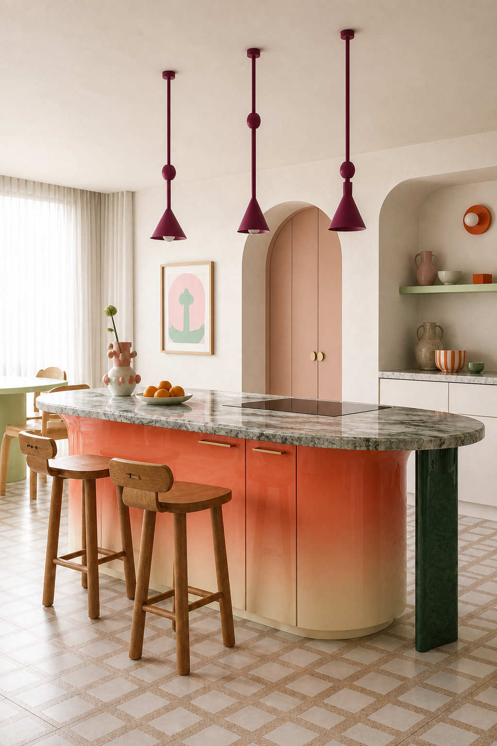
The most joyful space of the five — and the one that most completely demonstrates the gradient's potential as a piece of furniture rather than a wall treatment. The kitchen island fades from a deep, warm coral at its top edge through orange, peach, and salmon to a pale butter cream at its base — a top-to-bottom gradient that reads like a sunset captured in lacquered cabinetry. The island is the room's undeniable star: not just the largest piece of furniture in the kitchen, but the most chromatically complex object in the entire space.
The green marble worktop is the gradient's perfect counterpart. Its cool, veined surface — grey-green, organic, geological — sits above the warm fade of the island body like a layer of cool morning air above a warm earth. The contrast between the fluid, human-made gradient below and the ancient, found pattern of the marble above creates a layering of time as much as color: the instant and impulsive warmth of the gradient against the deep time of the stone.
The arched cabinetry in blush pink behind the island, the mint green open shelf, the chequerboard terrazzo floor, and the trio of deep burgundy pendant lights complete a kitchen of extraordinary color confidence — a room that has made a dozen bold decisions and somehow made every single one of them work together. The gradient island is the anchor that holds this composition in place: its fade from coral to cream picks up every other color in the room and dissolves them into a single, continuous warmth.
Design tip: A gradient kitchen island — fading from a saturated color at the top to a pale tone at the base — reads as a single piece of furniture with the complexity of a painting. It is the most impactful gradient application in any kitchen and the one that photographs most dramatically.
Explore this concept and create your own.
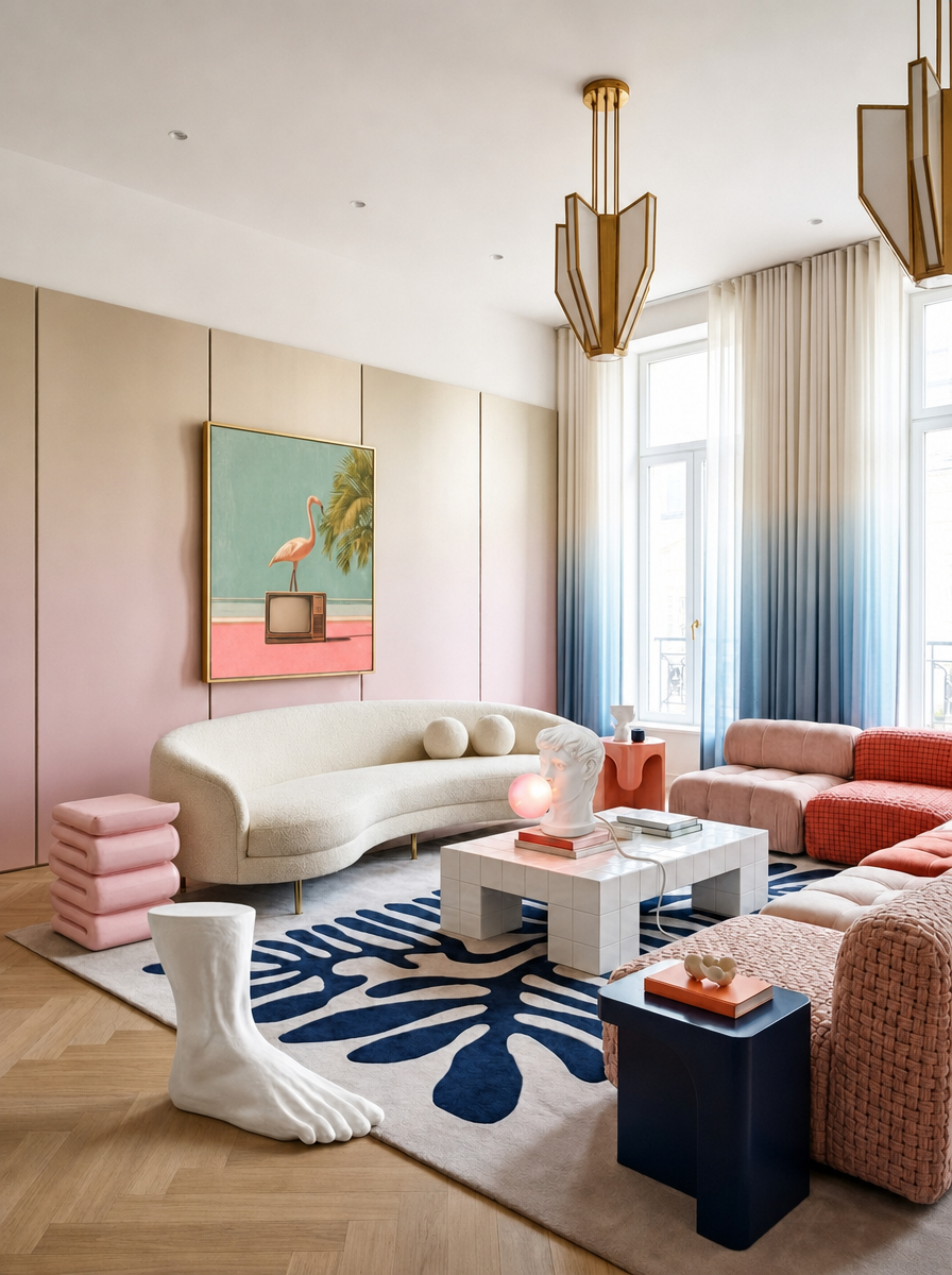
The most eclectic and most culturally layered space of the five — and the one that deploys the gradient in its most textile, most literally draped form. Floor-to-ceiling curtains in a long, precise ombré transition from warm blush pink at the top to deep, clear cobalt blue at the hem frame the room's tall windows, turning the wall of glass into a gradient canvas that shifts color as the eye travels downward. Against the warm herringbone parquet floor and the ivory plasterwork walls, this color transition — from warm to cool, from pink to blue — reads as both decorative and architectural, defining the window wall as a destination rather than simply a light source.
The room's furniture is a masterclass in confident eclecticism. A curved ivory bouclé sofa on slender legs, a tufted blue-white marble coffee table styled with a Classical bust and a globe lamp, a chunky pink-and-coral modular sofa, a large white sculptural foot, a monstera-leaf rug in deep navy and cream, and an Art Deco brass pendant chandelier — this is a room that has assembled its contents from multiple eras and multiple aesthetic traditions and held them together through sheer confidence of color and curation.
The blush-to-cobalt curtains are what make this work. By placing a gradient — a surface in which warm and cool simultaneously coexist — at the room's primary architectural feature, the designer has created a backdrop that can accommodate the pink sofa, the blue rug, the ivory furniture, and the brass lighting simultaneously. The gradient curtain does not compete with any of these elements. It contains all of them.
Design tip: Ombré curtains — fading from one color at the top to a complementary or contrasting color at the hem — are the most versatile gradient application in any living space. They accommodate multiple color families simultaneously, making them the ideal backdrop for eclectic, mixed-palette rooms.
Explore this concept and create your own.
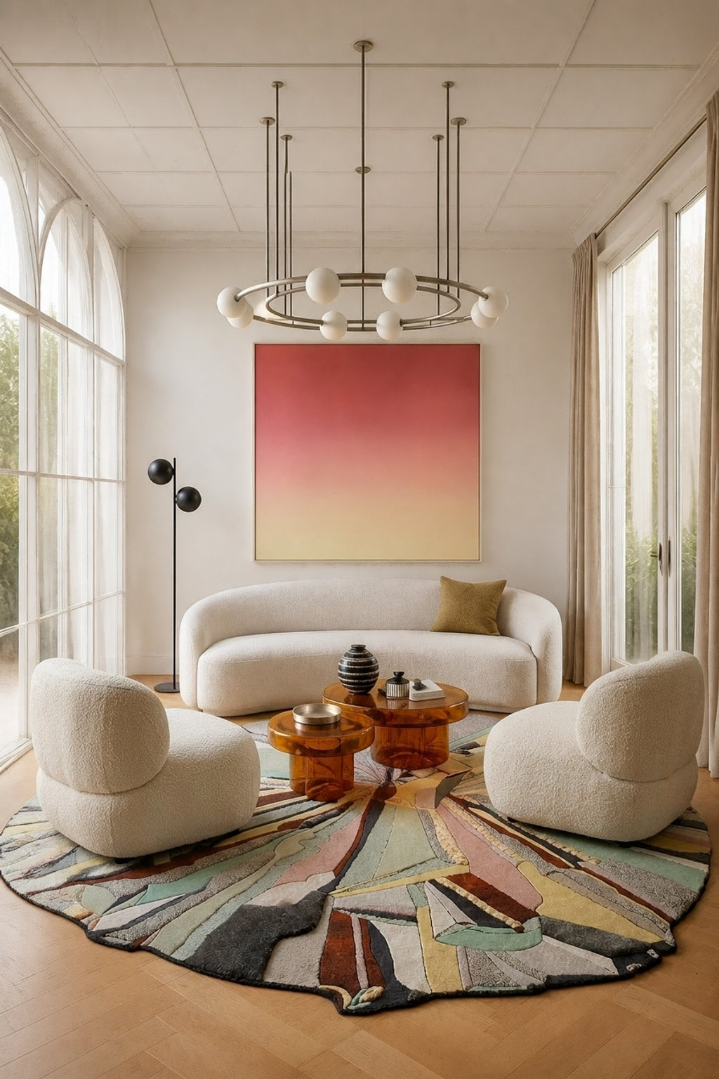
The most serene space of the five — and the one that makes the most sophisticated argument for the gradient as a purely artistic gesture in an interior context. A large-format painting — its surface fading from a deep, warm crimson at the top through coral, salmon, and peach to a pale, luminous gold at the bottom — hangs on an otherwise entirely white wall in a room of complete calm. This is a gradient not applied to furniture or textile but hung on a wall as a painting, and it performs exactly as a great painting should: it gives the room its emotional center and its chromatic identity without touching a single architectural surface.
The room's restraint is the painting's gift to it. Walls of pure white plaster, an arched window bringing in soft natural light, a circular brass-and-sphere chandelier of elegant geometry, a curved cream bouclé sofa, two matching low bouclé armchairs, and a pair of amber glass coffee tables — all of these are beautiful, considered objects in their own right. But without the gradient painting, the room would be calm to the point of emptiness. With it, every object in the room acquires a warm, crimson-gold tint that makes the cream bouclé warmer, the amber tables richer, and the entire room feel as though it is lit by a perpetual, private sunset.
The circular, hand-tufted rug — its geological composition of terracotta, sage, slate, and cream forming an abstract landscape — echoes the painting's gradient logic at the floor level, creating a conversation between ceiling height and floor level that gives the room a vertical coherence unusual in contemporary living room design. This is a space that has understood something fundamental: that a gradient, placed correctly, can do the emotional work of an entire palette without imposing itself on a single square meter of architecture.
Design tip: A large-format gradient painting — hung on a white wall in an otherwise neutral room — colors the entire space without touching the architecture. The gradient's tones reflect into the room, tinting every surface with warmth, and give the room its emotional identity through art rather than paint.
Explore this concept and create your own.
A top-to-bottom gradient reads as a sunset or a horizon — warm above, cool below, or light above, dark below. A side-to-side gradient reads as a panorama. The direction of your gradient determines the emotion it generates, so choose it as carefully as you choose the colors within it.
A gradient in lacquer, in dip-dyed textile, in ceramic glaze, or in iridescent metal is a fundamentally different experience from a digital or painted gradient. The physical imprecision — the slight unevenness of the fade — is what gives material gradients their warmth and their credibility.
A large-format gradient painting or print gives a room its entire color identity without touching the architecture. It is the most reversible, most repositionable, and most immediately impactful gradient application available — and the easiest entry point into the trend.
A gradient surface performs most powerfully against a neutral, uncompetitive backdrop — white plaster, raw concrete, pale stone. When everything else is still, the gradient's movement becomes the entire visual event of the room.
Natural light from different angles and at different times of day changes how a gradient reads — what is pale in morning light may appear saturated by afternoon, and vice versa. Commission gradients with this in mind: position them where the light will animate them throughout the day.
Iridescent surfaces — which shift between colors as the viewer moves — are gradients experienced over time and through space rather than at a glance. They are the most dynamic and most technically demanding gradient application, and the most rewarding when used with confidence alongside contrasting matte materials.
The gradient interior is, at its heart, a refusal of the definitive. Where a single flat color says "this is what this room is," a gradient says something far more interesting: "this is what this room is becoming." That quality of transition — of a surface caught in the act of changing — is what gives gradient interiors their unique emotional register. They feel alive in a way that static color never quite manages, because life itself is a gradient: a continuous, never-quite-resolving transition from one state to another.
The five spaces featured here have each understood this — and each has found a different way to bring that quality of transition into the built environment. The bathroom where the vanity glows from within. The kitchen where the cabinetry shifts color as you move. The island that fades like a sunset. The curtains that hold warm and cool in the same fold of fabric. The painting that colors an entire room without touching a single wall.
In a design landscape that has spent years celebrating the purity of single colors and the clarity of hard edges, the gradient arrives as a reminder that the most beautiful things — light, weather, the human face, the horizon at dusk — have always been in transition. And that designing with that quality in mind produces interiors of extraordinary, quietly unmatchable beauty.
Create your own mesmerizing gradient-inspired interiors at MattoBoard.com
.png)
.png)