Bubblegum pink is making a bold return in 2026, proving that pink can be playful, architectural, sophisticated, and deeply livable all at once. From soft blush bathrooms and powder-pink salons to neon shower rooms and immersive hot-pink studios, the color is being used with confidence rather than apology. The strongest interiors treat pink as more than an accent — using it across tile, plaster, ceilings, upholstery, and joinery to create warmth, energy, and emotional impact. Whether calm or electric, bubblegum pink works best when paired with texture, warm lighting, grounding materials, and a clear design point of view.
.png)
"Bubblegum is the color that refuses to take itself too seriously - and that refusal is precisely what makes it one of the most fearless, most joyful, and most surprisingly sophisticated design choices of 2026."
Hot pink. Candy pink. Shocking pink. Neon blush. Whatever you call it, bubblegum has burst into the interior conversation with the unstoppable energy of its namesake - sweet, bold, and impossible to ignore. From ribbed-tile bathrooms crackling with neon to powder-soft Parisian salons drenched in the gentlest blush, the pink spectrum is being explored at every voltage in 2026. These six spaces prove that bubblegum is not a color for the faint-hearted - or the beige-committed.
Pink's history in the interior is a story of constant reinvention - a color that has meant entirely different things to different eras, that has been claimed and reclaimed by successive generations for radically different purposes, and that has never, at any point in its design history, been truly neutral. Pink is always a statement. The only question is what kind.
The 18th century's most celebrated interiors embraced pink without reservation. Madame de Pompadour - Louis XV's influential mistress and one of the great design patrons of the Rococo - commissioned an entire palette of roses and blushes for the interiors of Versailles, and the Sèvres porcelain factory created a pink glaze in her honor that became known as rose Pompadour. These were not delicate, apologetic pinks. They were saturated, confident, and unmistakably powerful.
The 20th century gave pink its most complex series of reinventions. The 1950s made it the color of suburban domesticity - pink kitchens, pink bathrooms, pink Cadillacs. Elsa Schiaparelli's Shocking Pink of the 1930s had been transgressive and avant-garde; by the mid-century, pink had been domesticated into something safe and slightly saccharine. The feminist movements of the 1960s and 70s rejected it as a symbol of enforced femininity. Then punk reclaimed shocking pink as an act of aggression.
The 2010s brought millennial pink - a blush so carefully calibrated to read as sophisticated and gender-neutral that it swept through interior design, fashion, and branding simultaneously. But millennial pink was, by design, quiet. It whispered. Bubblegum, the 2026 iteration, does no such thing. It is the full spectrum of pink unleashed — from the softest powder blush to the most electric neon magenta — deployed with the confidence of a color that has finally stopped worrying about what anyone thinks of it.
The cultural moment driving bubblegum pink's interior triumph is not unrelated to the broader Barbiecore phenomenon that swept popular culture from 2023 onward - a reclamation of exuberant, unapologetic femininity as a site of power and pleasure rather than limitation. In this context, a bubblegum bathroom or a hot-pink retail space is not frivolous. It is a position.
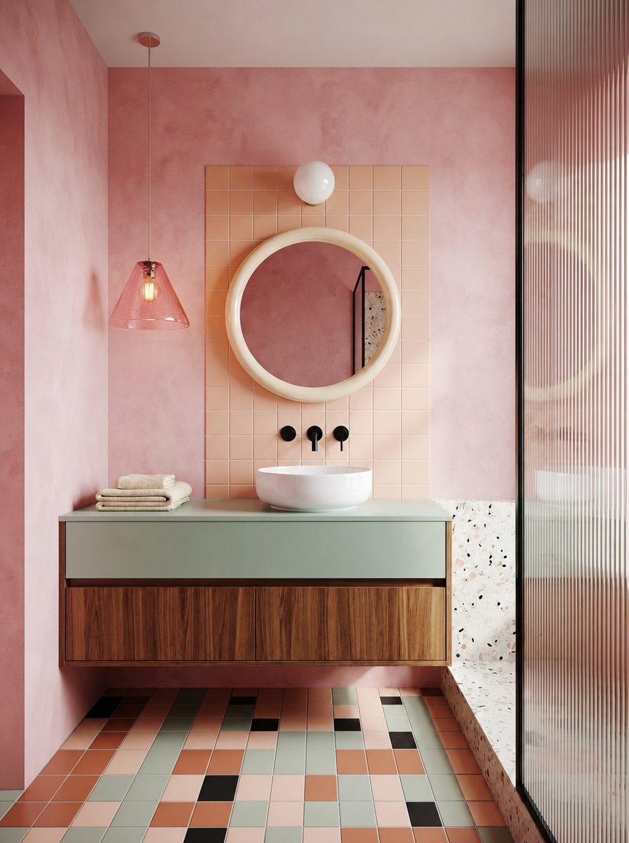
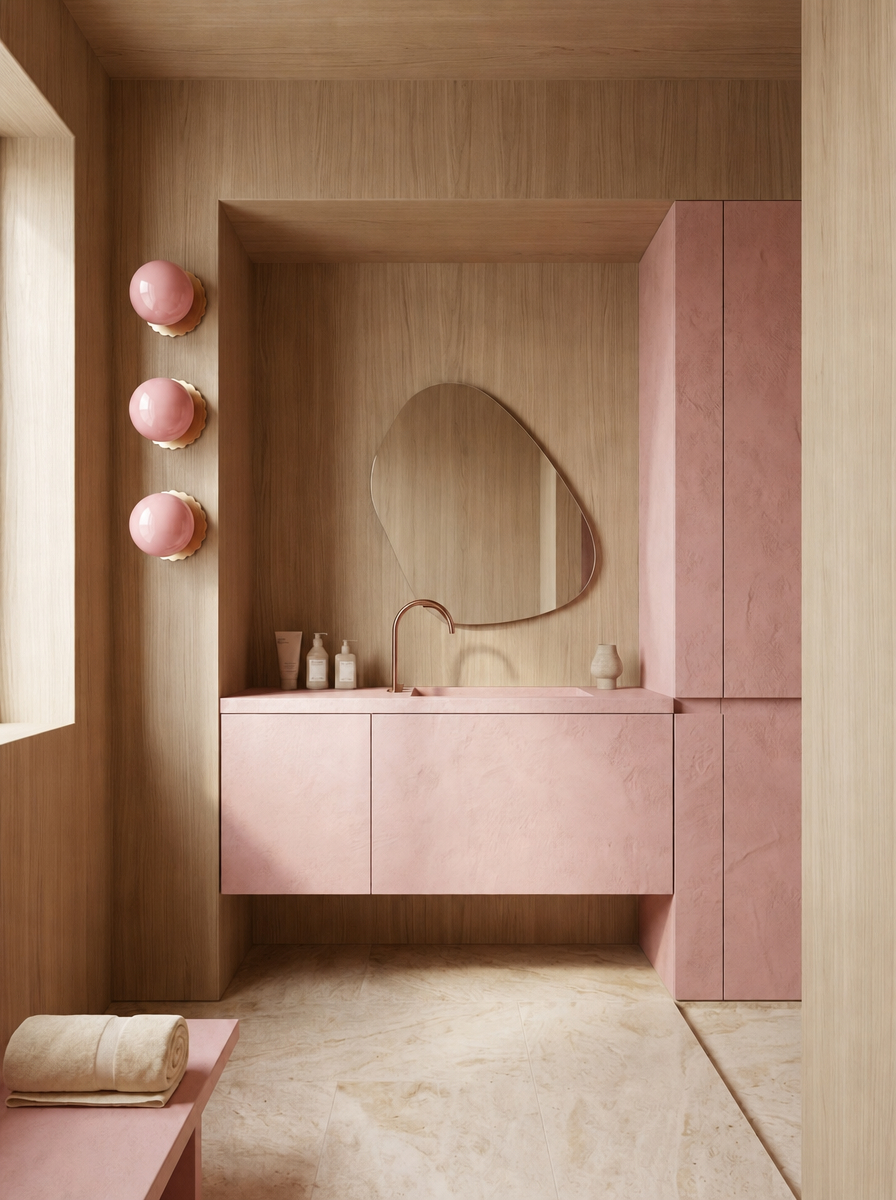
The most considered space of the six - and the one that makes the most sophisticated argument for bubblegum pink as a genuinely liveable color. Soft blush-pink tile covers the walls in a warm, matte grid that reads almost as a neutral in the context of the room's other strong design decisions: a sage green floating vanity, a terrazzo floor of multicolored fragments, an oval mirror in natural timber, and a warm wooden stool. The pink is everywhere - and somehow, entirely calm.
This is bubblegum pink at its most architecturally intelligent: used as the room's foundational color rather than its accent, it creates a warm envelope that makes every other material look better inside it. The sage green of the vanity is more verdant against the pink; the terrazzo fragments pop more vividly; the timber reads warmer and richer. Pink here is not competing - it is hosting.
The multicolored terrazzo floor is the room's secret weapon. Its fragments of terracotta, sage, coral, and cream tie together every other color decision in the room and prevent the pink-and-green pairing from feeling binary. This is a bathroom that rewards looking — at the tile, at the floor, at the interplay of materials — and that makes the daily ritual of using it a quietly pleasurable experience. For searches like "pink bathroom ideas that aren't too much" or "how to use pink in a bathroom without it feeling dated," this room is the answer.
Design tip: Blush pink tile used as a wall-to-wall field color - rather than as an accent - creates warmth and enclosure without aggression. Pair it with one cool-toned element (sage, duck egg, slate) to prevent the room from reading as sugary.
Explore this concept and create your own.
.jpg)
The most electrifying space of the six - and the one that completely abandons any pretense of restraint. Floor-to-ceiling ribbed pink tile in a shade that sits somewhere between hot pink and magenta covers every surface of this shower room, lit from below by a neon strip that turns the already-vivid color into something approaching a light installation. This is not a bathroom you wander into half-asleep. This is a room that wakes you up before you even reach the shower controls.
The ribbed tile is essential to the room's success. A flat hot-pink tile at this scale would be visually overwhelming; the vertical ribs create a play of highlight and shadow that gives the color depth and rhythm, making the walls feel dynamic rather than flat. The glossy ceramic surface amplifies the neon light, multiplying the pink across every reflective plane and turning the entire room into a continuous luminous experience.
The single note of contrast - a peach-toned vessel basin that softens the electric pink to something warmer — prevents the room from reading as purely aggressive. It is one material decision that shifts the entire emotional register from confrontational to joyful. This is dopamine decor at its most concentrated: a room that delivers its entire emotional payload in the first second you spend inside it.
Design tip: Ribbed tile in a saturated color diffuses light across its vertical surfaces, creating depth and movement that flat tile cannot. In an all-pink bathroom, the ribs are what prevent the color from feeling oppressive.
Explore this concept and create your own.
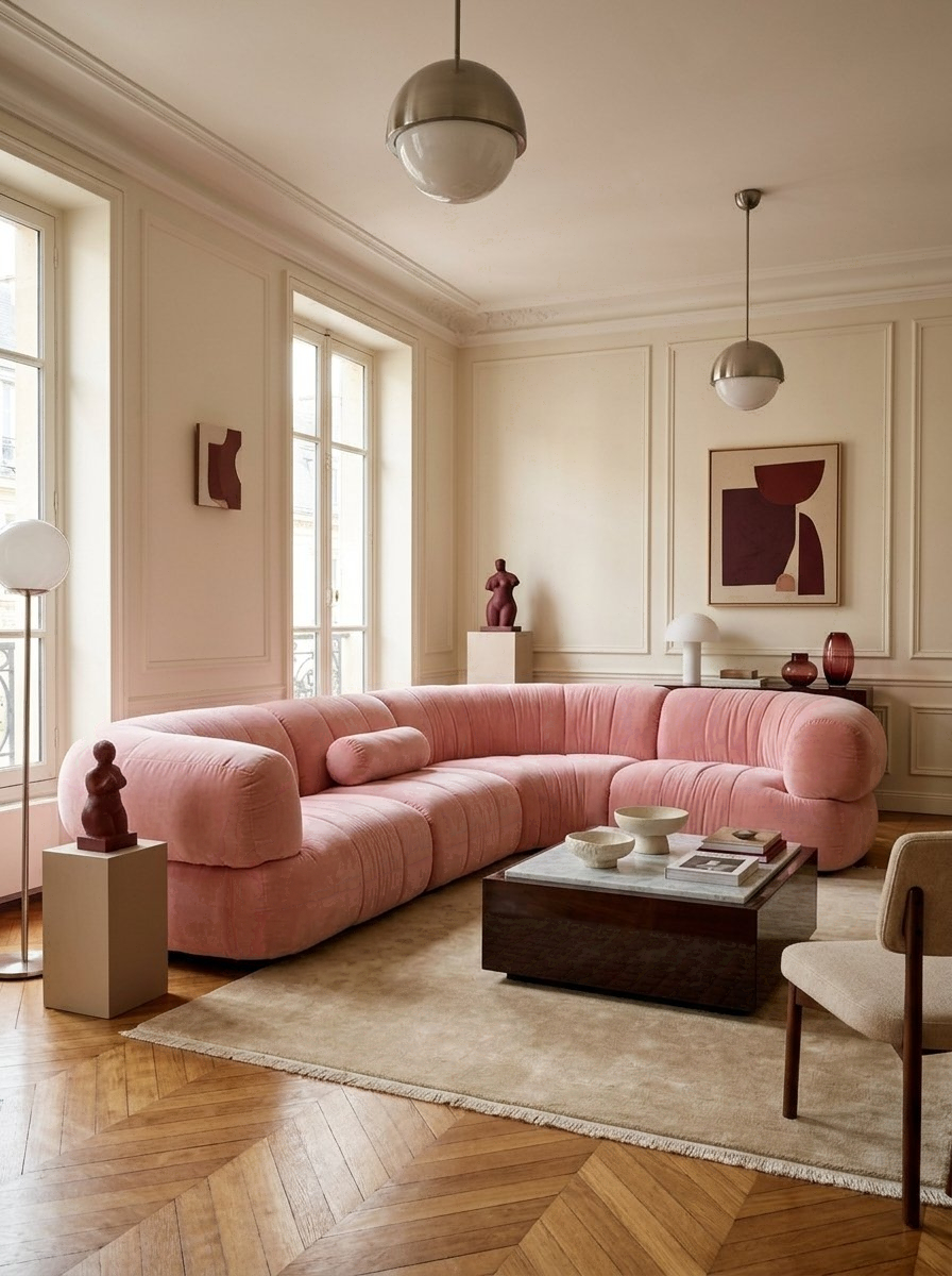
The most refined space of the six - and the one that most elegantly demonstrates that bubblegum pink exists on a spectrum that includes genuine sophistication at its softer end. A Haussmann apartment living room dressed in warm ivory plaster, herringbone parquet, and a generous curved sectional sofa upholstered in the softest powder pink imaginable. The room breathes pink without announcing it - the color arrives through the upholstery, the tones of the walls, the warm light from the tall French windows, all pulling in the same gentle direction.
The curved sofa is the room's defining piece. Its generous, embracing form - all rounded corners and deep cushions - carries the pink in a way that feels body-shaped and inviting rather than decorative. The low coffee table in pale stone, the dark wood occasional table, and the artwork in burgundy and cream provide the material gravity that prevents the room from floating away into pure softness.
This is bubblegum pink for a room where you actually want to sit down, stay awhile, and feel genuinely held. It answers searches for "pink living room ideas that feel grown-up" and "how to use pink in a Parisian interior" with complete authority - and it makes a compelling case that the softer end of the bubblegum spectrum is not less committed than the neon end, just differently confident.
Design tip: In a large living room, deliver bubblegum pink through the upholstery rather than the walls - the color arrives through the room's most inhabited, most tactile surface, which makes it feel warmer and more personal than a painted room.
Explore this concept and create your own.
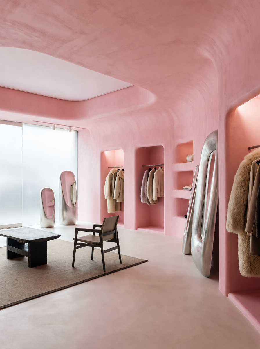
The most culturally resonant space of the six - and the one that shows bubblegum pink operating at its most powerful in a commercial or studio context. An open-plan studio or showroom space with warm, textured hot-pink plaster walls, a floor-to-ceiling pegboard display wall in the same saturated magenta, pink-plastered display niches, and a pink ceiling that turns the entire room into a total color environment. The space reads simultaneously as boutique, gallery, and set - a room that has understood that in 2026, the most powerful design statement a brand can make is a complete, immersive color world.
The hot pink plaster walls - with their textured, slightly uneven surface - prevent the color from reading as flat or corporate. The plaster's organicism gives the pink warmth and depth, making it feel hand-applied and intentional rather than sprayed on. The pegboard display wall is a masterstroke: its grid of regular holes allows hanging fixtures to be repositioned at will, combining the flexibility of a retail display system with the visual rhythm of a permanent architectural element.
The furniture and objects within the space - dark bentwood chairs, sculptural white forms, natural timber surfaces - are deliberately understated, allowing the pink to perform without competition. This is the lesson of the great monochromatic commercial interiors: when the color is this strong, everything else must serve it. The space answers searches for "pink retail interior design," "studio pink color scheme," and "bold commercial interior ideas 2026" with the kind of complete visual commitment that makes those searches feel instantly resolved.
Design tip: In a commercial or studio space, hot pink plaster walls create a total color environment that photographs consistently well under any lighting condition — making the space as powerful on social media as it is in person. That dual performance is one of bubblegum's greatest commercial assets.
Explore this concept and create your own.
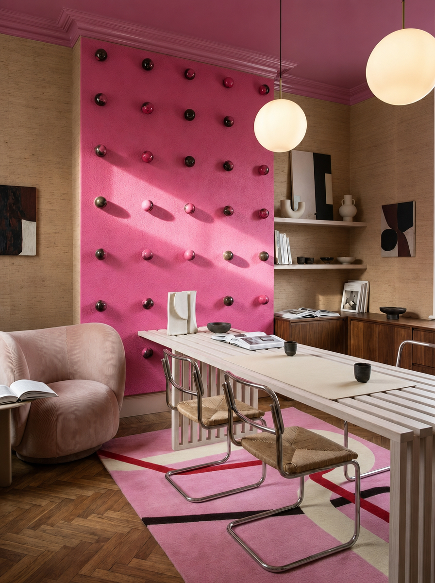
The space that most directly challenges the received wisdom about what a productive working environment should look like. A home office or studio space with a candy pink ceiling, warm blush plaster walls, open shelving displaying objects and books with the confident informality of a personal collection, and a globe pendant that glows warm against the pink overhead. This is a workspace designed around the idea that joy and productivity are not opposites - that a room can make you feel genuinely glad to be in it and simultaneously energized to work.
The pink ceiling is the room's primary architectural decision. In a workspace, the ceiling is often the most neutral, most ignored surface - painted white as a matter of course, contributing nothing to the room's character. Here, a candy pink ceiling turns the overhead plane into the room's most expressive feature, creating a warm, enveloping quality that makes the space feel intimate and personally charged rather than generic and functional.
The warm globe pendant against the pink ceiling creates a light-within-light effect - the warm bulb amplifying the pink's warmth, the pink ceiling reflecting the light back downward in a diffused, flattering glow. This is a room that understands that the quality of light in a workspace is as important as the quality of the furniture, and that pink is one of the most light-amplifying colors available.
Design tip: In a home office, using pink on the ceiling rather than only the walls creates a softer, more immersive workspace without overwhelming the desk zone. Pair it with warm globe lighting, open shelving, and grounded natural textures to turn the room into a joyful, light-enhancing environment that still feels focused enough for daily work.
Explore this concept and create your own.
The final space makes the quietest argument of the six - and in the context of this collection, quiet is its own kind of radical. A bathroom or dressing space entirely resolved in the palest, most powdery blush pink: integrated joinery, warm plaster walls, a soft oval mirror, and barely-there pink cabinetry that reads almost as a warm white in some lights and unmistakably pink in others. This is bubblegum pink at its most meditative - present, considered, and deeply restful.
The integrated joinery is the room's defining material decision. By building the cabinetry flush with the walls and finishing both in the same pale pink plaster tone, the designer has created a room with no visual seams - a continuous envelope of soft color that wraps the user completely. It is the same principle as color drenching, but at the most delicate end of the spectrum: not an immersive burst of saturated pink, but a gentle, all-encompassing warmth that you only fully register after a few moments inside it.
This is bubblegum for people who believe that pink should feel like a breath rather than a shout - and it proves conclusively that the color's range is broad enough to serve both impulses with equal elegance. For searches like "minimalist pink bathroom ideas" or "pale pink interior design," this room is the destination.
Design tip: Matching integrated joinery to plastered walls in the same pale pink tone creates a seamless color envelope - the room feels designed as a single object rather than furnished, and the gentleness of the pink makes the experience of being inside it quietly extraordinary.
Explore this concept and create your own.
Bubblegum pink is a spectrum, not a single color. Decide first whether you want the neon end (electric, dopamine, confrontational) or the powder end (calm, enveloping, sophisticated). Both are valid - but they require entirely different supporting casts.
Ribbed tile, textured plaster, bouclé upholstery - any surface with physical texture breaks up the color and gives it movement. Flat, glossy pink at scale can feel relentless; textured pink feels alive and layered.
Sage, forest, duck egg, or olive - green is the color that grounds bubblegum pink without diminishing it. The pairing is rooted in nature (blossom and leaf) and works at every scale, from a single towel to an entire vanity unit.
Blush and candy pink ceilings reflect warm light downward rather than absorbing it - making rooms feel brighter and warmer simultaneously. It is the most underused application of the color and the one with the most dramatic return on investment.
Powder rooms, corridors, and internal bathrooms - spaces with no natural light that are typically painted white by default - are transformed by bubblegum pink. The color creates warmth and intimacy that makes the lack of daylight a feature rather than a deficiency.
The single biggest mistake with bubblegum pink is hedging - adding so many neutral counterweights that the pink loses its conviction. Once you commit to pink, commit fully. The rooms that succeed with this color are the ones that mean it.
Bubblegum pink is having a moment that feels less like a trend and more like a reckoning - a color that has spent decades being underestimated, over-gendered, and strategically deployed in small, apologetic doses finally being given the full architectural treatment it has always deserved. The spaces featured here span the full spectrum of what pink can do: from the neon shock of the ribbed shower room to the barely-there whisper of the powder bathroom, from the Parisian restraint of the blush salon to the full-commitment color immersion of the hot-pink studio.
What they share - across all their differences of shade, scale, and application - is an absence of apology. Not one of these rooms has hedged. Not one has added a beige cushion to balance things out, or a grey wall to give the eye somewhere neutral to rest. They have committed to pink as a conviction, and in doing so they have produced spaces that are joyful, surprising, and impossible to forget.
Sugary, joyful, and addictive. The bubblegum interior is here. And once you have spent time inside one, the only question you will find yourself asking is why you waited so long.
Create your own Bubblegum Interior Moment at MattoBoard.com
.png)