
Luxury retail design in 2026 is moving beyond traditional stores and becoming a full interior experience — one built around atmosphere, storytelling, and emotional connection. As online shopping handles convenience, physical retail now has to offer something more meaningful: spaces people want to enter, stay in, and remember. From warm gallery-style boutiques and immersive pink plaster interiors to cultural bookshop salons, peach-toned sanctuaries, and green garden-like corridors, the strongest luxury stores are using residential comfort, rich color, sculptural ceilings, curated displays, and living materials to create brand worlds rather than simple shopping environments. The future of luxury retail is not about selling more efficiently — it is about making the act of being there feel unforgettable.
"The best luxury retail spaces of 2026 are not stores. They are arguments — for a way of living, a set of values, an aesthetic position — that happen to contain things you can buy."
Something fundamental has shifted in the way luxury brands think about physical space. At a moment when everything that can be bought can be bought online, the store has been forced to ask itself a question it never previously had to answer: why should anyone come here? The most compelling answer the industry has found is not convenience, not price, and not product range. It is experience. And in 2026, that experience is being delivered through some of the most considered, most beautiful, and most genuinely surprising interior design being produced anywhere in the world.
The luxury store has always understood that the environment in which objects are presented is inseparable from the value those objects carry. The great Parisian maisons of the 19th century — the couture houses of the Rue de la Paix, the jewelers of the Place Vendôme — invested in interiors of deliberate opulence: marble floors, gilt mirrors, velvet-lined display cases, and the studied hush of spaces designed to make the customer feel that they were entering a world apart from the street outside.
The 20th century brought a series of retail revolutions. The minimalism of the 1990s — driven by brands like Prada, Helmut Lang, and early Jil Sander — stripped the luxury store back to its essentials: white walls, concrete floors, sparse product display, and an atmosphere of deliberate austerity that communicated exclusivity through the conspicuous absence of decoration. The store as art gallery became the dominant luxury retail model, and it produced some of the most architecturally significant retail spaces of the century — most notably Rem Koolhaas's Prada Epicenters in New York and Los Angeles.
But white walls and concrete floors, however architecturally rigorous, have a ceiling. By the 2010s, the gallery model had become so ubiquitous across luxury retail — from fashion to jewelry to skincare — that it had lost its power to differentiate. When every luxury store looks like a white cube, the white cube ceases to communicate luxury and begins to communicate simply: emptiness.
The post-pandemic retail environment accelerated the search for an alternative. With footfall reduced and the case for physical retail needing to be remade from scratch, the most forward-thinking brands began investing in stores that offered something the internet genuinely could not: an immersive, multi-sensory, deeply personal experience of a brand's world. Color returned. Warmth returned. Material richness, furniture, books, art, scent, and the careful choreography of a journey through space all returned — not as nostalgia for the 19th-century salon, but as a genuinely contemporary answer to the question of what physical retail is for.
In 2026, the luxury retail interior is the most exciting design category in the built environment. These five spaces show exactly why.
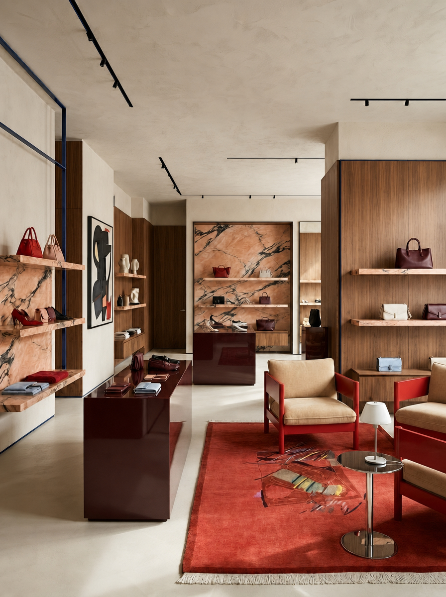
The opening space sets the tone for the entire 2026 luxury retail conversation with a single, decisive rejection of the white-cube model. Warm timber joinery, a veined marble display wall in rose and amber tones, deep burgundy lacquered display shelving, a generous red rug anchoring a seating area of cream and tan leather chairs, and art displayed on the walls with the casualness of a private collection — this is a retail space that has been designed to feel like the home of someone with very good taste rather than a store that happens to sell things.
The residential quality is the point. By furnishing the space with chairs you would actually want to sit in, a rug you would actually want to walk on, and art that has no price tag, the store creates an atmosphere of welcome and familiarity that the white cube never could. The customer is not a browser in a gallery; they are a guest in a very beautiful room. That emotional repositioning changes everything — it lowers the guard, extends the dwell time, and creates the conditions for genuine connection with the objects on display.
The burgundy display shelving is the room's most commercially intelligent decision. Deep, saturated color against warm timber makes the displayed products — bags, accessories, ceramics — appear more vivid, more precious, and more individually considered than they would on a white or neutral background. Color in retail display is not decoration. It is curation.
The marble wall — its warm rose and amber veining picking up the tones of the rug and the timber — performs as both backdrop and artwork simultaneously. It gives the back of the store a depth and material richness that draws the eye forward, creating a natural journey through the space without any directional signage or commercial choreography. This is retail design that trusts the architecture to do the selling.
Design tip: In luxury retail, residential warmth is a commercial strategy. Pair warm timber, expressive marble, generous rugs, real seating, and artful display with deep saturated shelving to make products feel curated rather than stocked — and to turn browsing into lingering.
Explore this concept and create your own.
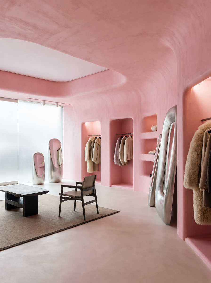
The most immersive retail space of the five — and the one that makes the most uncompromising case for color as brand identity. Every surface — walls, ceiling, floors, display niches, furniture — is finished in the same warm, textured pink plaster. The arched display niches are carved directly from the plaster walls like caves within a cave, creating recessed worlds for individual products that give each item the quality of a sculptural object rather than a retail unit. The organic, almost geological quality of the curved forms — no right angles, no hard edges anywhere — makes the space feel grown rather than built.
The effect on the products displayed within is transformative. Against an all-pink plaster backdrop, a dark timber chair, a black marble table, and the muted tones of displayed clothing all acquire a sharpness and clarity that neutral retail environments never produce. The pink does not compete with the products — it frames them, warmly and completely, like a sunset framing a silhouette.
The frosted glass window at the far end of the space — allowing diffused natural light to enter without revealing the street beyond — maintains the sense of a sealed, self-contained world that is the space's fundamental quality. You are not in a shop. You are somewhere else entirely. And that is precisely the point.
Design tip: Arched display niches carved from plaster walls give individual products a stage rather than a shelf — the enclosure and focused lighting of the niche transforms any object placed within it into a piece of sculpture.
Explore this concept and create your own.
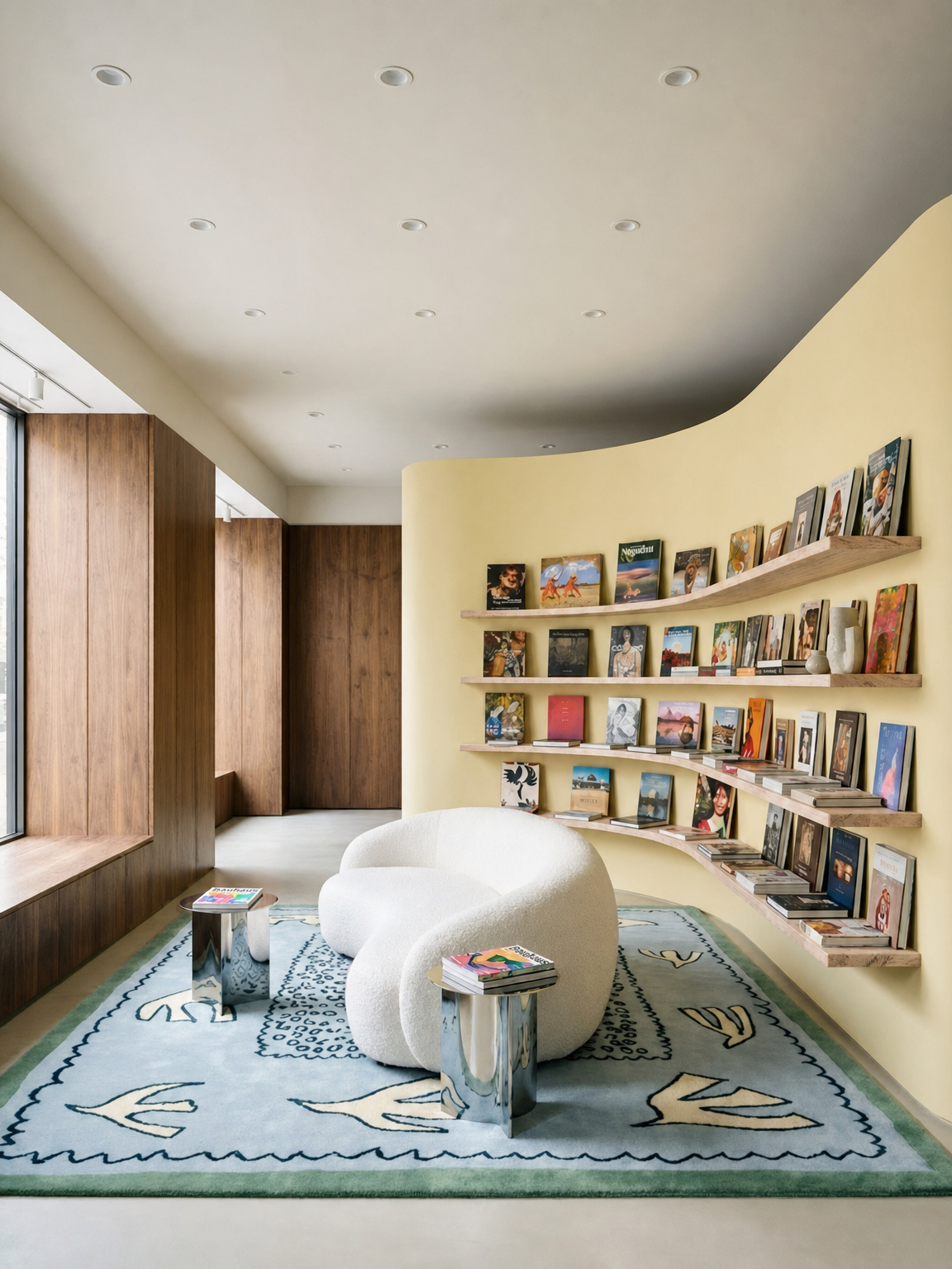
The most intellectually ambitious retail space of the five — and the one that most directly positions the store as a cultural destination rather than a commercial one. Butter-yellow walls, floor-to-ceiling warm timber shelving carrying hundreds of books spine-out in a rainbow of colors, a dramatically curved sculptural sofa in cream, a painted ceiling that sweeps from grey-blue to warm white in an organic, cloud-like form, and a hand-painted rug depicting botanical and figurative motifs — this is a space that has decided its primary product is not the objects on its shelves but the experience of being inside it.
The curved ceiling is the room's architectural masterstroke. Its organic, biomorphic form — neither flat nor conventionally vaulted, but somewhere between a wave and a cloud — creates a sense of shelter and enclosure that makes the space feel genuinely intimate despite its scale. The warm yellow walls and the amber light of the timber shelving give the room a permanently golden quality, like late afternoon light caught in amber, that makes every moment spent inside it feel slightly outside ordinary time.
The books themselves are the display — their spines creating a wall-to-wall color composition that is constantly changing as the stock changes. This is the most dynamic form of retail display imaginable: a living artwork made of other people's work, curated by the store's taste and regenerated with every new arrival. For any brand that wants to be associated with culture, intelligence, and the pleasure of the physical object, this is the retail interior model of 2026.
Design tip: A curved or sculpted ceiling in a retail space does more work than any other single architectural element — it creates shelter, intimacy, and a sense of arrival that flat ceilings simply cannot produce, regardless of how well everything else is designed.
Explore this concept and create your own.
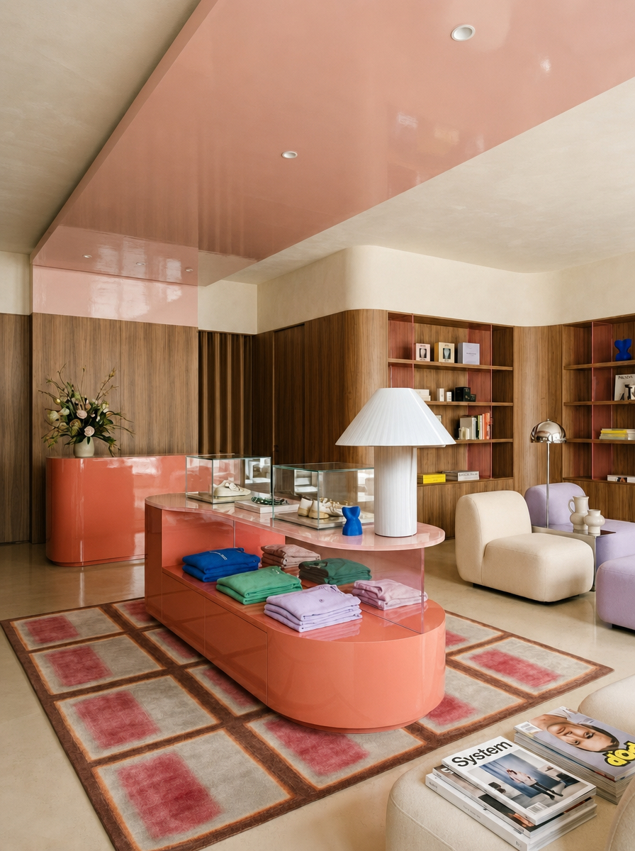
The most sensory retail space of the five — and the one that most directly borrows the emotional vocabulary of the domestic interior to create a store that feels like an act of genuine hospitality. A gloss peach ceiling bathes everything below it in warm, amber-tinted reflected light. A large coral-colored curved display plinth anchors the center of the floor, its organic form closer to a piece of furniture than a retail fixture. Cream upholstered chairs, soft textile folded in jewel tones, warm timber wall paneling, and a vase of fresh flowers complete a room that feels less like a store and more like a beautifully appointed drawing room in which beautiful things happen to be available for purchase.
The gloss peach ceiling is the room's single most powerful design decision. In a retail context, the ceiling is almost universally ignored — a plane of white or neutral that contributes nothing to the experience below it. Here, lacquered in warm peach, it becomes the room's primary light source, flooding the space with a glow that makes skin look luminous, textiles look richer, and the overall experience of being inside feel genuinely pleasurable in a way that cool, white-lit retail never achieves. This is a store that understands that how customers feel in a space is as commercially important as what they see in it.
The product display — textiles folded in neat stacks of coral, blue, green, and cream — functions as color composition rather than commercial arrangement. Each folded piece is as much an element of the room's palette as a product available for sale, blurring the line between display and decoration in a way that feels entirely effortless.
Design tip: A gloss ceiling in a warm tone — peach, amber, blush — transforms retail lighting entirely, replacing the harshness of overhead commercial lighting with a diffused warmth that makes both products and customers look their best.
Explore this concept and create your own.
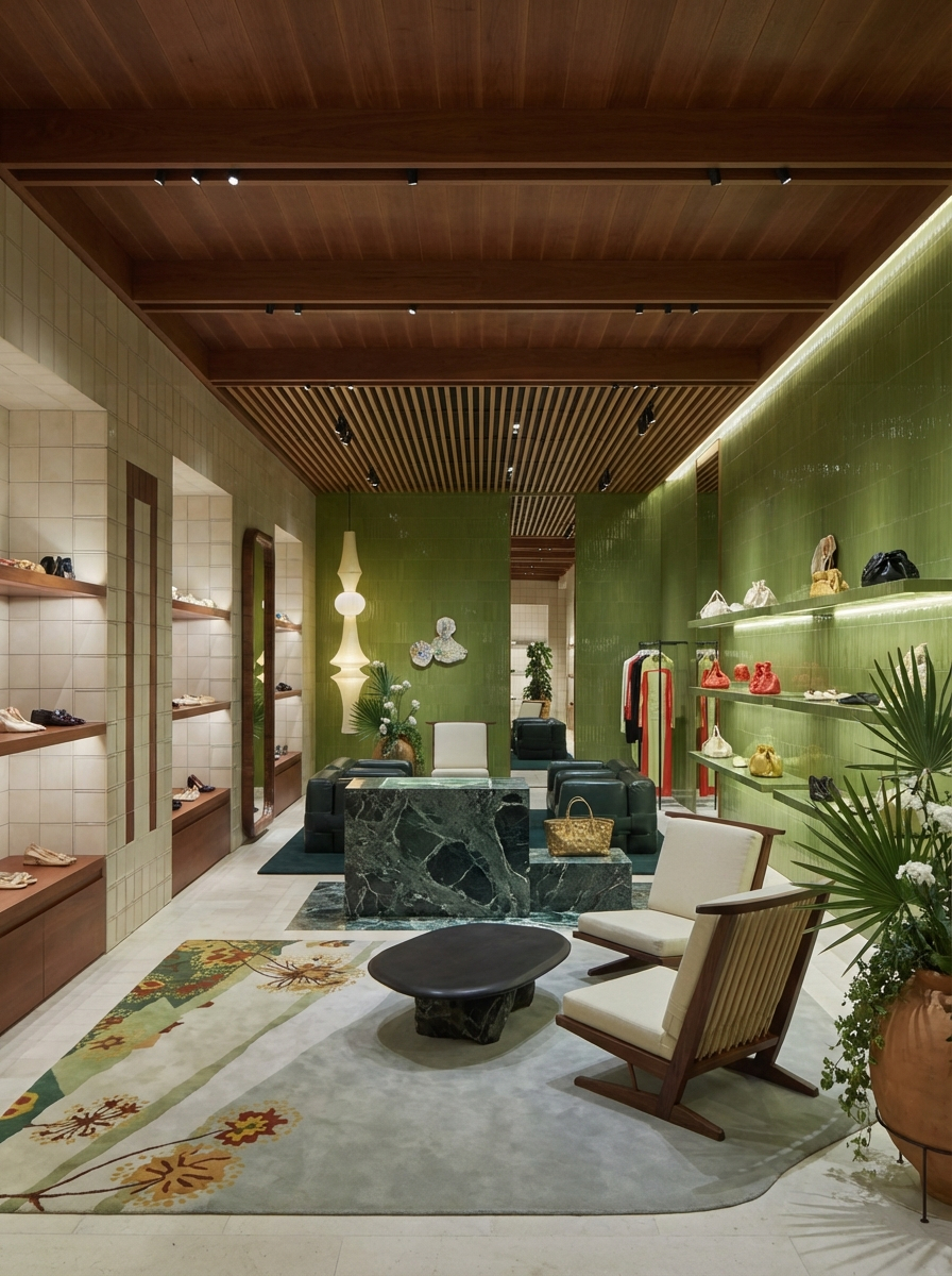
The final space makes the most quietly radical argument of the five: that a retail interior can feel like stepping outside — into a garden, a grove, a world of green and living things — while remaining entirely and deliberately indoors. Deep olive-green walls, a warmly lit slatted timber ceiling, green marble display surfaces, a large tropical palm, a pale grey stone floor, and carefully placed ceramics and objects create a space that has absorbed the aesthetic logic of the biophilic interior and applied it to a commercial context with complete conviction.
The deep olive green is the room's defining color decision — and one of the most considered color choices in this entire selection. Olive green occupies a unique position in the color spectrum: warm enough to feel welcoming, deep enough to feel sophisticated, botanical enough to feel connected to the natural world without the artificiality of a brighter, more obvious green. Against this backdrop, the warm honey tones of the timber ceiling glow with particular richness, and the pale grey stone floor provides the cool, neutral ground that prevents the green from overwhelming the space.
The long corridor format — a narrow, high-ceilinged passage that draws the eye forward — creates a retail journey of discovery rather than the panoramic overview of a conventional shop floor. Products appear incrementally, framed by the green walls and the warm ceiling light, each one encountered rather than merely browsed. This is retail as narrative: a space that tells a story at a walking pace, and trusts its customers to follow it to the end.
The tropical palm — its broad leaves breaking the geometry of the shelving behind it — is the space's living punctuation mark. In a retail context, planting of this scale communicates permanence, care, and a commitment to the space as a living environment rather than a temporary commercial installation. It says: this place is tended. And that quality of being tended — of being in a space that someone genuinely loves — is the rarest and most valuable quality any retail interior can possess.
Design tip: Large-scale planting in a retail corridor — a palm, a fig, an olive — breaks the linearity of the space and introduces the quality of a living, tended environment that no display fixture or artwork can replicate. Plants communicate permanence and care in a way that resonates immediately and instinctively.
Explore this concept and create your own.
The longer a customer stays, the more deeply they engage with a brand's world. Every design decision — seating, lighting, the quality of the floor underfoot — should make staying feel more appealing than leaving.
Deep, warm, saturated backdrops — timber, rich plaster, dark lacquer — make displayed objects appear more vivid and more individually considered than white or neutral environments. Color is the most powerful tool in the retail designer's arsenal.
Residential furniture — real chairs, real rugs, real lighting — communicates welcome and warmth in a way that commercial fixtures never can. The best luxury retail spaces feel like exceptionally well-designed homes that happen to contain things for sale.
A gloss, painted, curved, or warmly lit ceiling transforms the emotional register of any retail space. In a world of white retail ceilings, a considered overhead plane is one of the most differentiating design decisions a brand can make.
Arched niches, individual plinths, and deeply considered display surfaces give each product the quality of an object rather than a unit of stock. Restraint in display quantity communicates abundance in brand confidence.
Large-scale planting — a palm, a fig, an olive — communicates permanence, care, and a commitment to the space as a living environment. Plants make retail spaces feel tended rather than temporary, and that quality resonates immediately with any customer who values quality.
The luxury retail interior of 2026 is, at its most fundamental level, an answer to a question that digital commerce cannot answer: what does it feel like to be here? Not what does the product look like, not how quickly can it be delivered, not what is the return policy — but what does it feel like, in the body and the senses, to spend time in this particular place? The five spaces featured here have all understood that this is the only question that matters for physical retail in the current moment, and they have each answered it with the full force of their design intelligence.
The warm gallery that feels like a private home. The pink cave that feels like stepping inside a brand's dream. The bookshop salon where culture and commerce blur so completely that the distinction ceases to matter. The peach pavilion where the ceiling makes everyone look beautiful. The green corridor that feels like a garden you can buy things from. Each is a different answer to the same question — and each is more compelling than anything the internet can offer.
Physical retail is not dying. It is evolving into something far more interesting: spaces designed not to sell efficiently, but to be experienced deeply. And in the hands of designers who understand that the environment is the message, these spaces are becoming some of the most beautiful, most considered, and most genuinely pleasurable interiors being produced anywhere in the world.
Create your own luxurious retail store at MattoBoard.com
.png)
.png)