Honeyed, luminous and endlessly warm - peach is the color rewriting the rules of the modern interior. From zellige-tiled bathrooms to gloss-lacquered Parisian salons, these five spaces prove that the softest color in the spectrum is also, quietly, the most confident.
"Peach is the color that feels like the light has already done half the work for you — warm, generous, and quietly luminous in a way that no other color on the spectrum quite manages."
Not since the rise of millennial pink has a single color so thoroughly captured the interior design conversation. Peach - that soft, sun-warmed meeting point between blush, terracotta, and amber - has become the defining color story of 2026. But this is not a timid, accessory-level presence. Designers are using peach to drench entire rooms, tile whole bathrooms, lacquer ceilings, and wrap hallways floor to wall. The color has arrived at full volume, and these five spaces show exactly what it looks like when peach is given the space to perform.
Peach has always existed somewhere between the safe and the daring - close enough to neutral to feel liveable, saturated enough to feel genuinely designed. Its history in interiors is one of quiet, recurring presence: never the loudest color in the room, but always the one that makes the room feel most alive with warmth.
"In the Rococo salons of 18th-century France, the warm apricot tones of Venetian plasterwork were considered the most flattering backdrop imaginable - a color that made candlelight glow and complexions luminous."
The color's roots in European interiors run deep. The sun-baked plaster walls of Mediterranean architecture - from Andalusian cortijos to Portuguese quintas to Italian farmhouses - have always carried the warm, dusty peach tones of natural pigment and fading sunlight. These were not designed colors; they were the colors that heat, time, and mineral-rich earth produced naturally on rendered surfaces. The fact that peach feels simultaneously ancient and contemporary is no accident - it is encoded in the color's material DNA.
The 20th century gave peach several distinct moments. The 1920s and 30s saw it appear in the powder rooms and boudoirs of Art Deco interiors - used alongside gilt, mirror, and black lacquer to create spaces of unapologetic feminine glamour. The 1980s brought a softer, more muted peach - the color of Laura Ashley wallpapers and chintz curtains - which, like so many things from that decade, was eventually consigned to the category of "dated" before it had truly been appreciated.
What distinguishes today's peach from its predecessors is its material ambition. Earlier iterations appeared primarily in soft furnishings - upholstery, curtains, wallpaper. Today's peach is an architectural color: applied to tile, plaster, concrete, lacquered cabinetry, and stretched ceilings. It has moved from the surface of the room to the bones of it, and that shift has transformed it from a color associated with prettiness into one associated with genuine design conviction.
The timing of peach's resurgence is also telling. After years of cool, grey-dominated interiors, and then a period of aggressive saturation driven by the dopamine decor movement, peach arrives as something different: warm without being loud, confident without being confrontational. It is the color for a moment that craves comfort and optimism in equal measure.

This bathroom opens the conversation with a masterclass in tonal color layering. Blush-peach zellige tiles cover the main wall - their handmade irregularity catching and scattering light in a way that perfectly-flat tile never could. The floating vanity unit drops to a deeper, richer terracotta tile, creating a color gradient from pale blush to warm clay that reads like a sunset captured in ceramic. Behind the glass screen, a shower clad entirely in translucent green onyx provides the counterpoint that makes the peach sing.
The green-and-peach pairing is one of the most instinctively satisfying color relationships in the spectrum - rooted in the natural world, where warm earth tones and cool foliage constantly coexist. Here, the onyx takes that relationship and makes it architectural: the luminous, veined green of the shower wall is not just a color contrast but a material one, its translucency and depth set against the matte, tactile surface of the zellige in a way that rewards sustained looking.
The burr-wood panel on the right-hand wall adds a third material voice - warm, richly grained, and organic - that anchors the room in something natural and human-scaled. This is peach at its most considered: not a single color decision but an entire material palette built around one warm, generous hue as its foundation.
Design tip: Zellige tile in peach or blush tones works because its handmade surface variation creates micro-shadows that give the color depth and movement no flat tile can replicate.

The most refined room of the five - and the one that best demonstrates peach's unique ability to turn a space into an atmosphere rather than simply a room. A Haussmann apartment with deep-peach walls and a high-gloss lacquered ceiling of the same color is suffused in the kind of warm, amber light that feels less like interior design and more like late afternoon on a Mediterranean terrace. Every surface is singing the same note, and the effect is genuinely immersive.
The gloss ceiling is the room's defining decision. By lacquering it in the same peach as the walls, the designer has dissolved the distinction between vertical and horizontal surfaces, creating an envelope of color rather than a room with colored walls. The ceiling's reflective finish bounces the light from the tall French windows back into the space, amplifying the warmth and giving the room a perpetual golden-hour quality regardless of the time of day.
Against this backdrop, the furniture makes its moves carefully. A curved cream bouclé sofa, a pair of slate-blue Togo sofas, and a simple peach-toned coffee table - the blue sofas are the masterstroke, providing the cool, complementary contrast that prevents the room from feeling oversweet. A gallery wall of black-and-white photography grounds the warmth with graphic precision. This is peach as a complete lifestyle aesthetic, effortlessly Parisian in its ease.
Design tip: A gloss ceiling in the same color as the walls creates total color immersion - the reflective surface amplifies daylight and makes the room glow from within, morning to evening.
.jpg)
The most architecturally ambitious space of the five - and the one that pushes the peach color story furthest into the territory of genuine world-building. Every surface here - walls, ceiling, fitted wardrobes, runner rug, console table - exists within the same warm, terracotta-peach palette, creating a corridor that feels less like a transitional space and more like a destination in its own right.
The curved walls are the room's structural revelation. By eliminating hard corners and replacing them with sweeping plaster curves, the designer has created a space with no visual interruptions - the color flows continuously from surface to surface without the hard stop of a right angle. This is color drenching in its most evolved form: not just painting everything the same shade, but designing the architecture itself to serve the color's ambition.
The copper ceiling light and bronze-toned mirror frames introduce a warm metallic dimension that deepens the peach rather than contrasting with it - copper and peach share the same warm, oxidized quality that makes them feel like natural partners. The sage-green arched display niche is the room's single moment of contrast - a cool, plant-filled counterpoint that makes the surrounding peach feel richer by comparison. This is peach at its most cinematic: a space that tells a complete visual story from entry to exit.
Design tip: Eliminating corners through curved plasterwork allows a color drench to flow without interruption - the result feels organic and enveloping rather than simply painted.
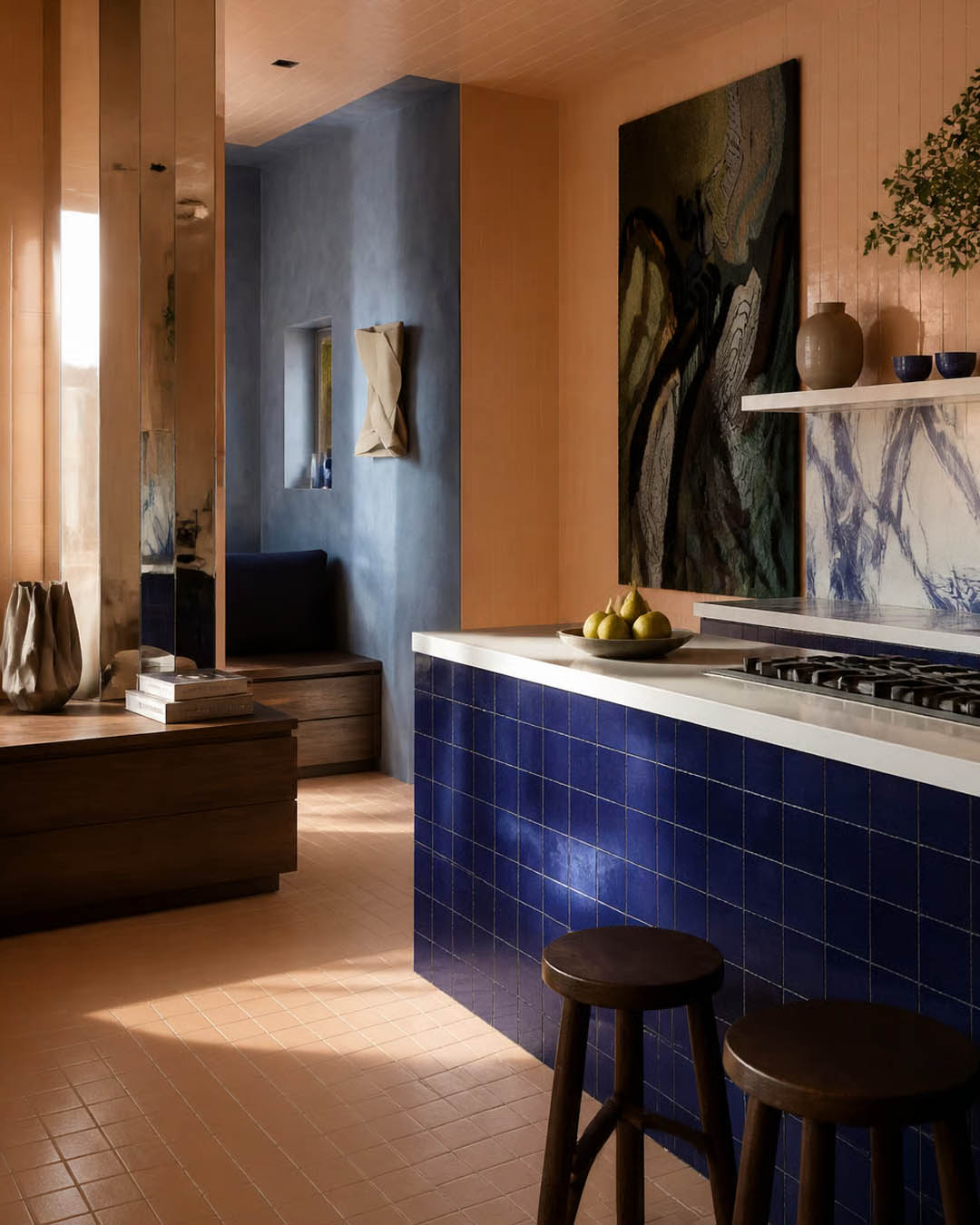
The most sophisticated color pairing of the five - and the one that most directly challenges the idea that peach is a soft, accommodating color. Here it confronts cobalt blue head-on: warm terracotta-peach tiles cover the ceiling and floor in an unbroken plane of warm color, while the kitchen island - clad floor-to-counter in deep cobalt zellige tile - drives a bolt of cool, electric blue through the center of the composition.
This is a deeply considered complementary color relationship. Peach and cobalt sit in near-opposition on the color wheel - warm orange tones against cool blue - creating the kind of visual tension that makes a room feel charged and alive. What prevents the pairing from feeling garish is the quality of the materials. Both the peach tile and the cobalt zellige have the handmade irregularity and matte depth of traditional craft ceramics, which gives the color contrast an organic, almost geological quality rather than a synthetic one.
The large abstract painting - dark, moody, alive with blue-green and black - bridges the two color worlds and gives the kitchen the quality of a gallery space. The mirrored column reflects the peach tile back across the room, doubling the warmth. The raw blue-grey plaster of the room beyond provides a third color voice - quieter, more atmospheric - that contextualizes both the peach and the cobalt and makes the overall palette feel rich rather than simply contrasting.
Design tip: Peach and cobalt blue is the complementary color pairing of the moment - warm and cool in conversation. Ground both in handmade tile to keep the contrast feeling crafted rather than graphic.
.jpg)
The final space makes the most unexpected argument of the five: that peach, deployed with sufficient lightness and restraint, can be one of the most genuinely calming colors in the interior designer's palette. This luminous, sun-filled space - with its smooth peach plaster walls, arched niches, and circular reception desk - feels less like a designed interior and more like a place the light itself has organized.
The sage-green and brass elements - the glass pendant lights in graduated tones from sage to blush, the brass-clad display columns, the muted olive ceiling fixtures - bring a cool, botanical counterpoint to the peach that prevents the room from feeling saccharine. The relationship between peach and sage here is perhaps the most instinctively pleasing color combination of the entire selection: warm skin tone against cool foliage, earth against leaf, the Mediterranean at its most effortlessly beautiful.
The sculptural white rocking chair and the curved reception desk introduce a language of organic form that complements the color's softness. Everything here curves - no hard corners interrupt the flow of peach from wall to arch to niche. The polished concrete floor reflects the warm color from above, creating the impression that the entire room is bathed in a single, continuous warm light source. This is peach as an emotional register: gentle, optimistic, and quietly extraordinary.
Design tip: Peach plaster walls paired with sage green accents is the color combination that feels most naturally calming — both colors are rooted in the organic world, and together they create a warmth that feels earned rather than applied.
The most sophisticated peach interiors layer multiple tones of the same color family - from pale blush to deep terracotta. Matching everything to one single shade reads flat; tonal variation reads rich.
Cobalt blue is the complementary color that makes peach sing loudest. Use it on a single feature element - an island, a sofa, a door - and the two colors will charge each other with extraordinary energy.
Where cobalt creates tension, sage creates harmony. Peach and sage together evoke the warmth of terracotta earth against cool Mediterranean foliage - a color relationship rooted in nature and instantly calming.
Zellige and other handmade ceramic tiles in peach tones carry micro-variations in surface and glaze that give the color a depth and movement that machine-made tile cannot replicate. Always choose craft over precision here.
A gloss peach ceiling above matte peach walls creates a luminous, enveloping effect -the ceiling reflects light downward, warming the entire room without the harshness of direct lighting. It is one of the most transformative single decisions in this color family.
Peach's warm, oxidized undertones align naturally with copper and bronze metalwork rather than bright gold. These metals feel like extensions of the color rather than contrasts to it, and they age together with the same grace.
Peach succeeds where so many interior color trends fail because it does not ask you to choose between warmth and sophistication. It offers both simultaneously - a color that is generous enough to make a room feel immediately welcoming, and complex enough to reward the kind of sustained, layered material thinking that produces truly great interiors.
The five spaces featured here span bathroom and salon, corridor and kitchen, retail space and private home - and across all of them, peach performs a different version of the same fundamental service: it makes the light feel warmer, the room feel larger in spirit if not always in scale, and the experience of being inside it feel, quite simply, better than it did before.
In a design landscape that has oscillated between cold grey minimalism and high-voltage dopamine saturation, peach arrives as something rarer and more enduring: a color with the warmth of the natural world, the versatility of a true neutral, and the quiet confidence of something that has always known its own value.
Create your own peachy interior fantasy at MattoBoard.com
.png)