Interior designer and stylist Iokasti on designing through feeling, editing with intention, and using MattoBoard to turn atmosphere into something tangible

For Iokasti, an interior rarely begins with a sofa, a paint color or a perfectly resolved reference image.
It begins with a feeling.
Cocooned or restorative. Playful or intimate. Moody, but not heavy. Elegant, with something slightly unexpected.
That emotional starting point runs through Iokasti’s work as an interior designer and stylist, where she moves between private residential projects, editorial styling and her role with Design Lab by Livingetc. Working across London and Athens, her practice combines interiors, trend research, product sourcing and visual storytelling, all connected by an interest in how people want to live.
Her route into design was not entirely traditional. After initially studying Marketing, with a particular interest in visual communication, consumer psychology and art direction, Iokasti went on to study Interior and Spatial Design at IED in Milan. It was there that materiality, craftsmanship and the relationship between objects within a space became central to the way she thinks about interiors.
Today, those ideas come together through one of the most important tools in her process: the mood board.
But for Iokasti, a mood board is not simply a collection of beautiful things.
It is where the design starts asking questions.
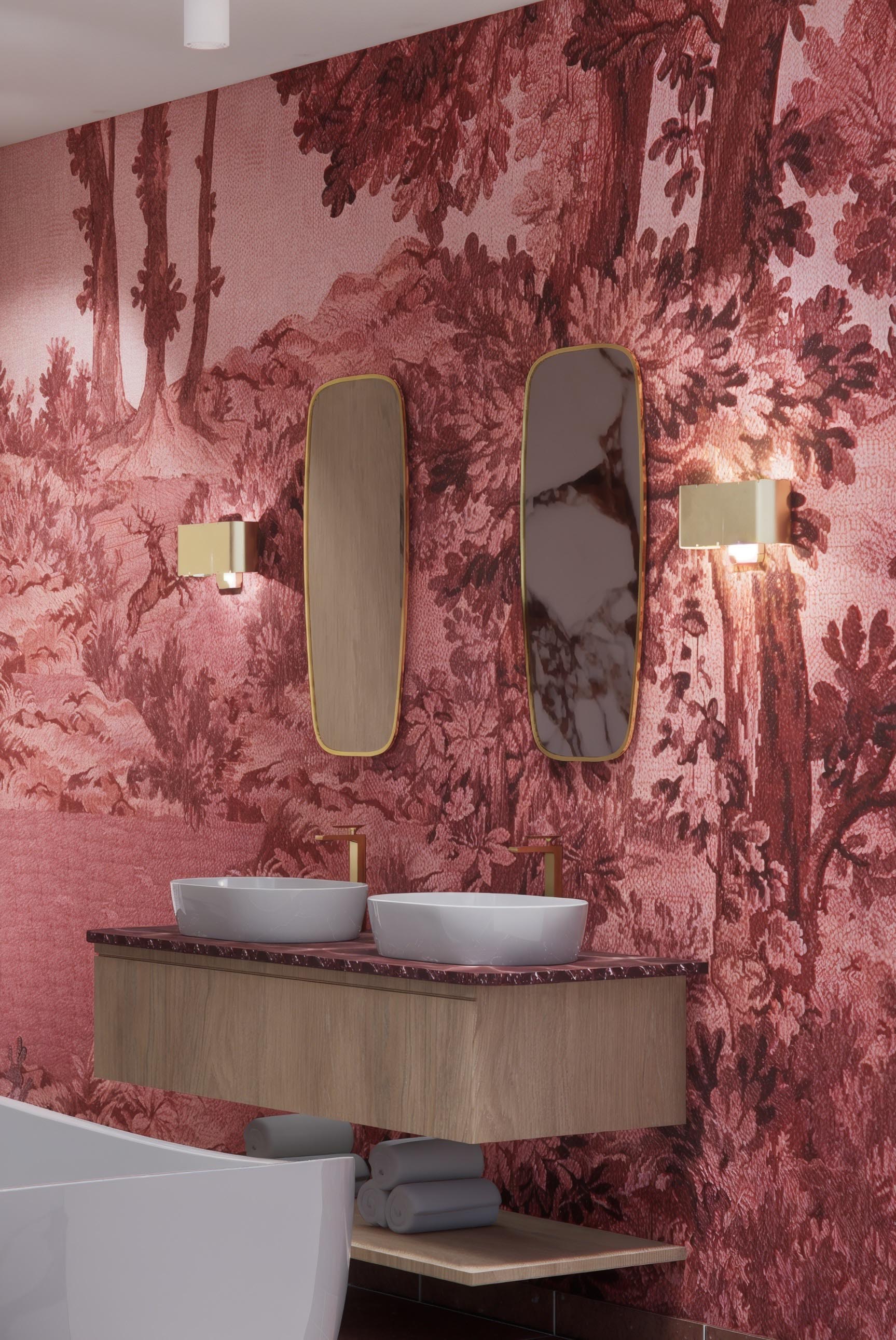
Before Iokasti begins selecting products, she defines how the space should feel.
An existing artwork, patterned rug, inherited chair, piece of stone or particular timber might become the first physical anchor, but the wider direction comes from understanding the atmosphere she wants to create.
From there, the process is deliberately instinctive.
Images, objects, colors and materials are collected because they capture something about that feeling, even before their relationship can be fully explained. Iokasti often writes down short phrases to keep the concept focused, such as “warm but not rustic” or “moody without feeling heavy”.
Those small distinctions matter.
They stop an interior becoming a literal interpretation of a style and leave room for tension, contrast and surprise.
As the references build, editing becomes just as important as collecting.
Is the same color appearing repeatedly? Are all the forms too soft? Does the palette need something darker, shinier or more architectural?
Eventually, the palette is reduced to a few anchors: a dominant material, a key color relationship and something that disrupts the expected direction.
The concept becomes clearer not by adding more, but by removing what does not earn its place.
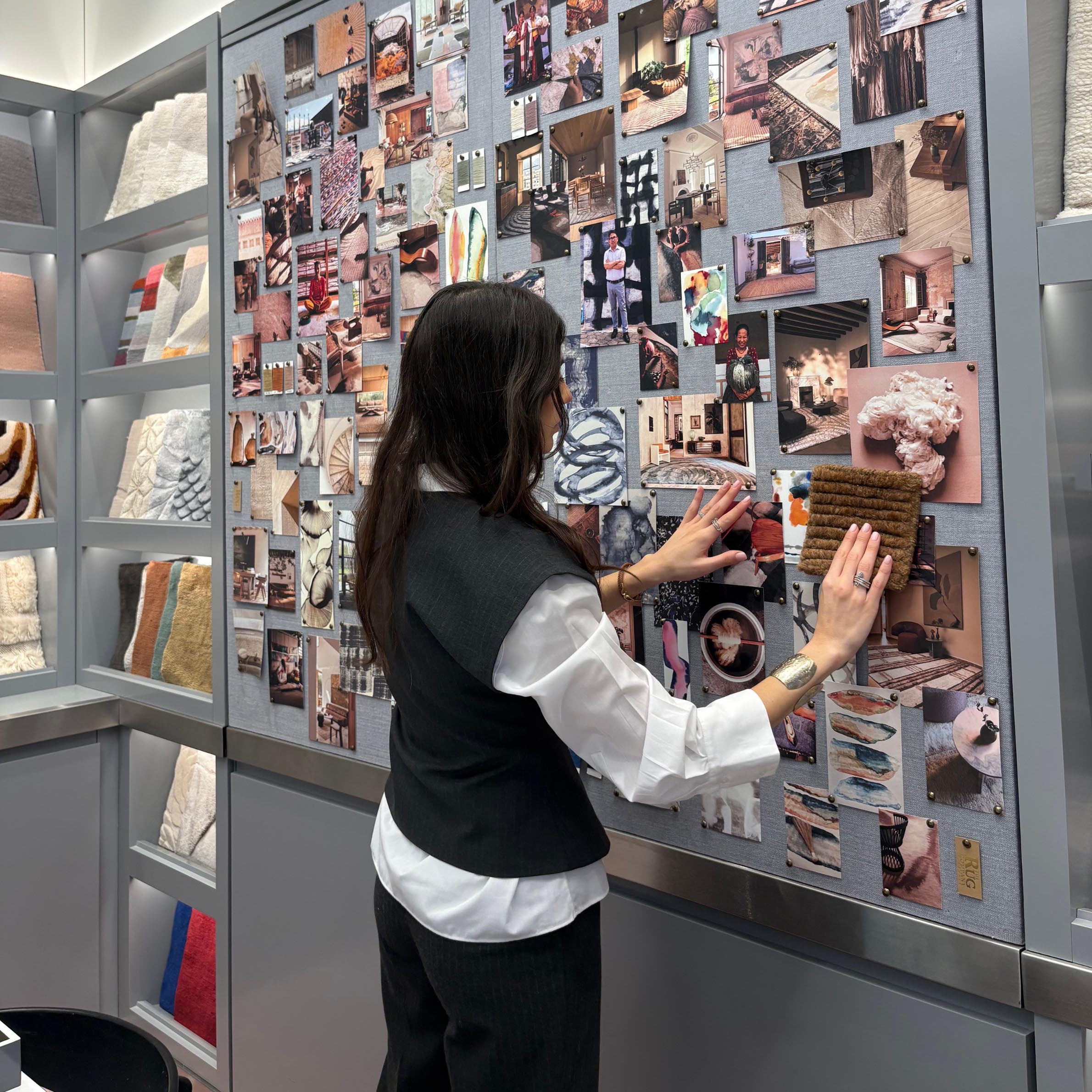
Iokasti describes the mood board as one of her main thinking tools.
Rather than asking whether individual products are attractive, she uses it to understand whether the different elements of the room are speaking the same visual language.
She is looking for what she calls the “emotional temperature” of the space.
Does it feel warm enough? Too polished? Too familiar? Does it have enough contrast?
For designers, this is a useful distinction.
A mood board does not have to answer “What exactly are we buying?”
Sometimes its more valuable role is answering “Are we creating the right feeling?”
That also makes it an important communication tool with clients. A client may struggle to define a style in design terminology, but they can usually tell whether a visual direction feels like them.
As Iokasti puts it, the strongest response is not necessarily that a client loves every individual object.
It is: “This is how I want my home to feel.”
Once that is established, the decisions that follow become much easier.
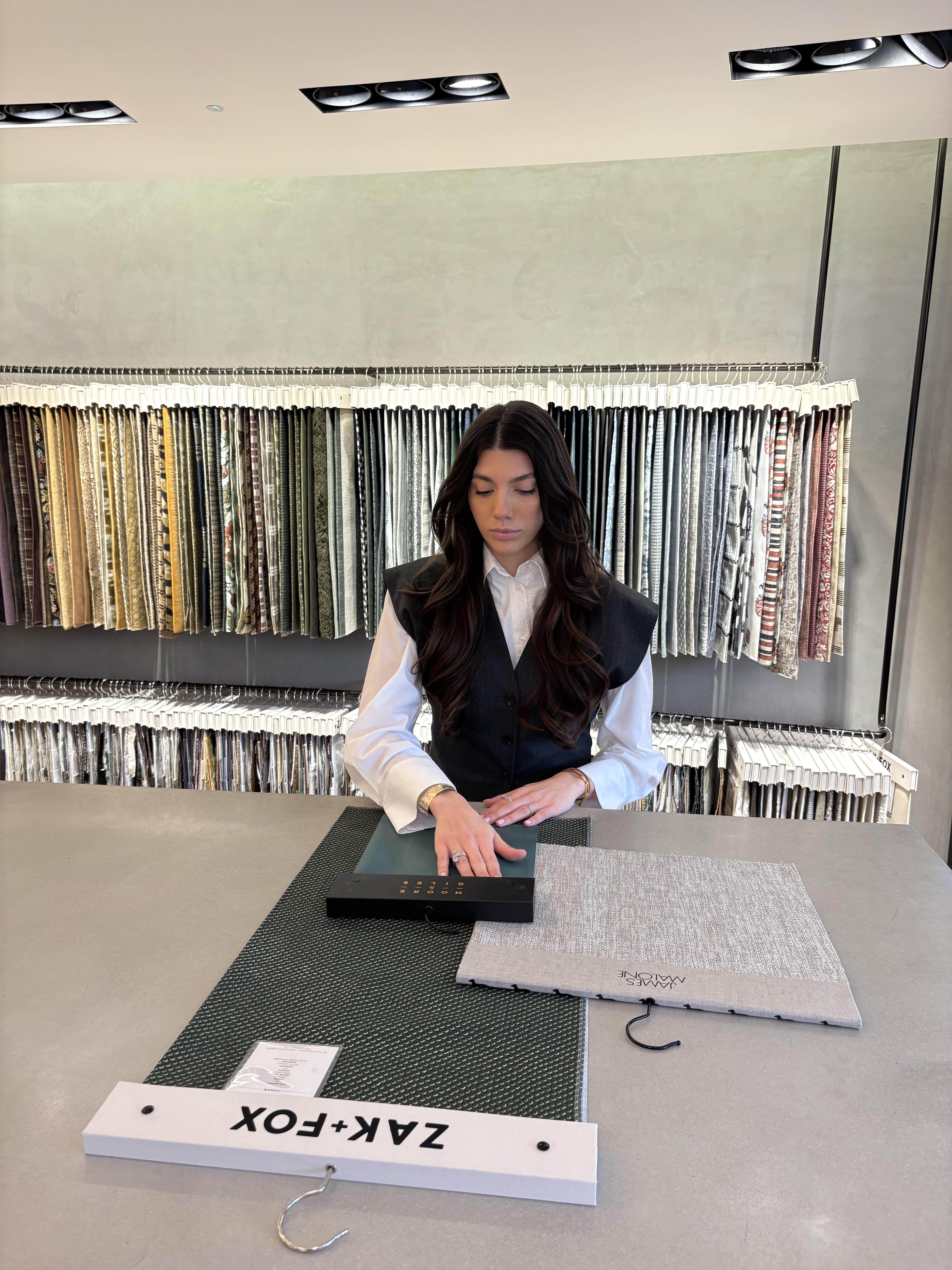
Iokasti’s editorial background has sharpened that instinct for editing.
Working with Livingetc means constantly looking at launches, emerging designers, new color directions and different ways of styling familiar pieces. But exposure to more does not necessarily mean using more.
Editorial work has taught her that every room needs a clear point of view.
She thinks about an interior in much the same way she might think about an editorial image: where the eye lands first, how it moves through the composition, where there is tension and where there is relief.
That might mean deep rust against sage green, glossy lacquer beside something tactile, or an antique object interrupting a contemporary scheme.
The same logic applies when she builds a mood board.
Material, silhouette, scale, light, shadow and negative space all matter. If every piece is curved, she may introduce something more architectural. If everything feels hard or precise, an irregular handmade object or softer fabric can bring relief.
And if every object wants to be the hero, something has to go.
That editing process became particularly clear in a recent color story built around sage green.
The first iteration was calm, tonal and harmonious, but it was also “slightly too polite”. Deep rust was introduced through the rug, black brought definition, brass added warmth and linen, bouclé and velvet gave the palette more tactile variation.
The green remained central, but it stopped being the entire story.
The lesson was simple:
A mood board should not only confirm your first instinct.
Sometimes its job is to show you what is missing.
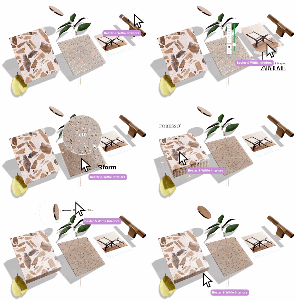
Iokasti first discovered MattoBoard while studying in Milan.
Because the course was highly material led, students were encouraged to think beyond color and furniture and consider how surfaces, textures and finishes relate physically.
That made the transition into MattoBoard feel natural.
On a flat mood board, timber, stone, metal and fabric can all become equally sized rectangles. In MattoBoard, those materials begin to regain thickness, texture, shadow and visual weight.
MattoBoard feels closer to building a physical sample board, but without being restricted by whatever samples happen to be available.
“I’m interested in how things feel together, not simply whether their colors coordinate.”
That extra dimension has changed how she thinks about hierarchy.
Glossy lacquer reflects light differently from open-grain timber. Velvet carries visual density in a different way from linen or bouclé. A heavily patterned stone may need something much quieter beside it.
Seeing those relationships more spatially can reveal when a palette is becoming too heavy before that imbalance reaches the room itself.
For Iokasti, the material board is a kind of abstract miniature of the final space.
The way materials overlap, respond to light and sit beside one another can tell you something about how balanced the eventual room might feel.
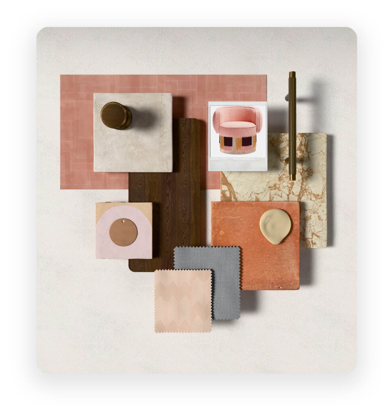
There is no fixed formula.
Usually, Iokasti begins with one or two strong references that establish the emotional direction, perhaps a stone, textile, artwork or atmospheric image.
Next come her own product images and any existing pieces that need to remain. This keeps the board rooted in the actual project rather than becoming a generic style exercise.
Larger surfaces tend to follow: timber, stone, flooring, wall colour and key fabrics. Smaller accents arrive later, once the quieter foundation has been established.
Even the composition itself has meaning.
Scale and overlap help communicate hierarchy.
What is the backdrop?
What supports it?
What is there to surprise you?
This is where the board starts becoming less about displaying materials and more about rehearsing the relationships that will eventually exist within the room.
When testing different directions, Iokasti uses a particularly useful approach for designers.
She keeps one or two core elements fixed and changes one material family at a time.
The same upholstery and rug might be tested against three different timbers. The palette might stay unchanged while brass, chrome and blackened metal are compared.
That restraint makes it much easier to understand what is actually affecting the mood of the scheme.
If everything changes simultaneously, it is difficult to know why one board feels stronger than another.
The flexibility also encourages experimentation.
A darker stone, unusual color or expressive pattern can be tried without feeling committed to it. Sometimes the experiment confirms that the quieter option was right. Sometimes it produces the unexpected detail that gives the room its identity.
It turns editing into something quicker, and importantly, more playful.
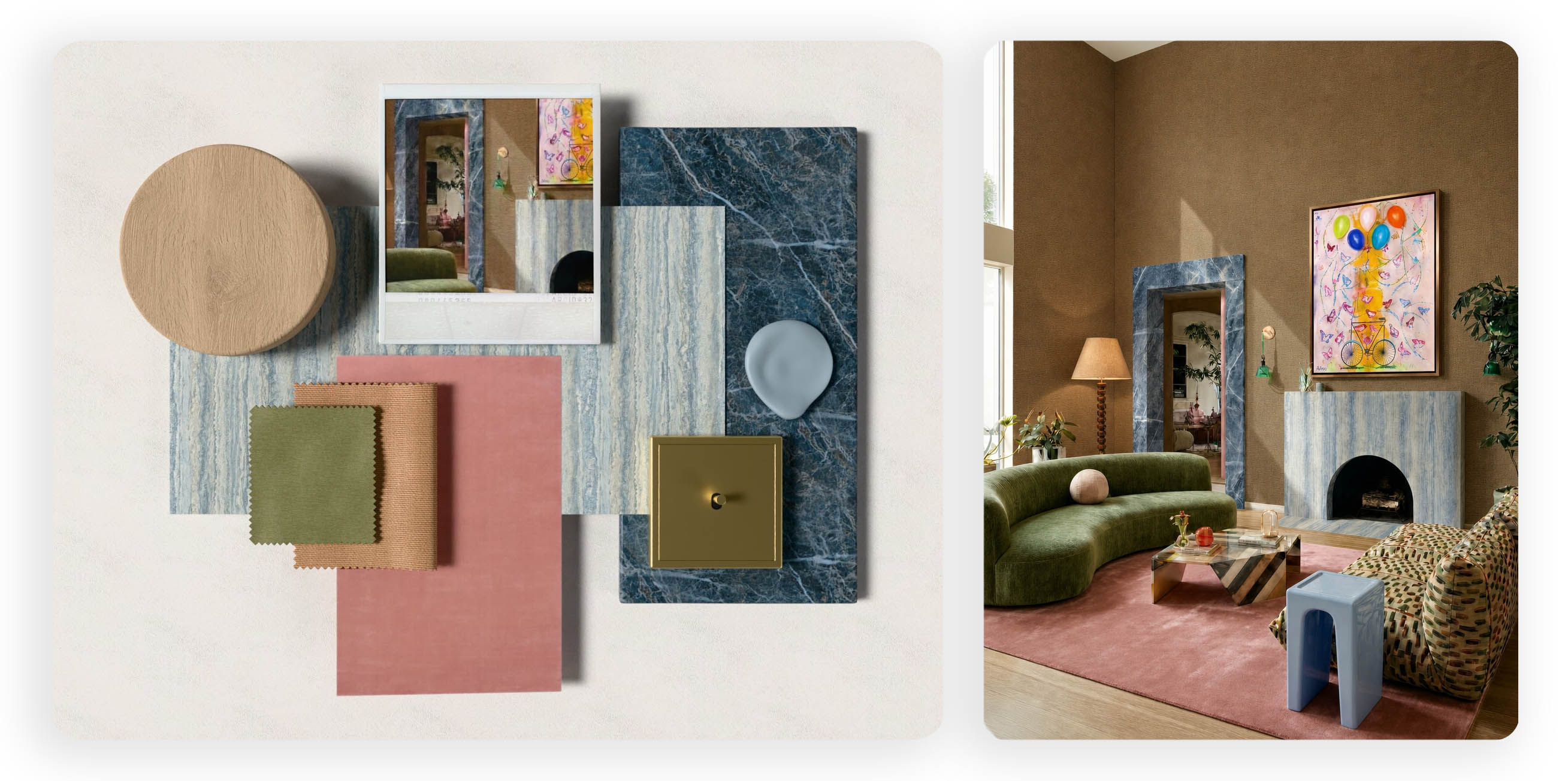
Mood boarding answers one set of questions.
Visualisation answers another.
For Iokasti, this is where MattoBoard’s Design Stream enters the process.
She sees it as sitting between the initial atmosphere and the more resolved interior. The material board establishes the ingredients, while the visualisation asks what happens when those ingredients begin occupying an actual space.
It is particularly useful when no existing reference image accurately expresses what she is imagining.
A room image, inspiration reference or brief can become a starting point for exploring a deeper wall color, oversized rug, unusual wallpaper or a material applied more extensively than a client might otherwise feel confident imagining.
The important part is that visualization remains exploratory.
It opens possibilities, but the designer still decides which are worth pursuing.
One recent living room demonstrated that clearly.
Iokasti had already sourced several pieces she liked individually, yet something about the room still felt unresolved.
Using visualization, she kept the architecture and principal furniture consistent and began changing the rug, artwork, tables and lighting.
She initially expected the problem to be color.
It was not.
The rug needed to be significantly larger to connect the seating group. The artwork needed more presence. The coffee table needed greater visual weight.
Those relatively simple changes transformed the composition.
What had felt like several good individual objects became one coherent room.
It is an important lesson for interior designers, particularly when a palette feels almost right.
Sometimes another product is not the answer.
Sometimes the problem is scale, proportion or hierarchy.
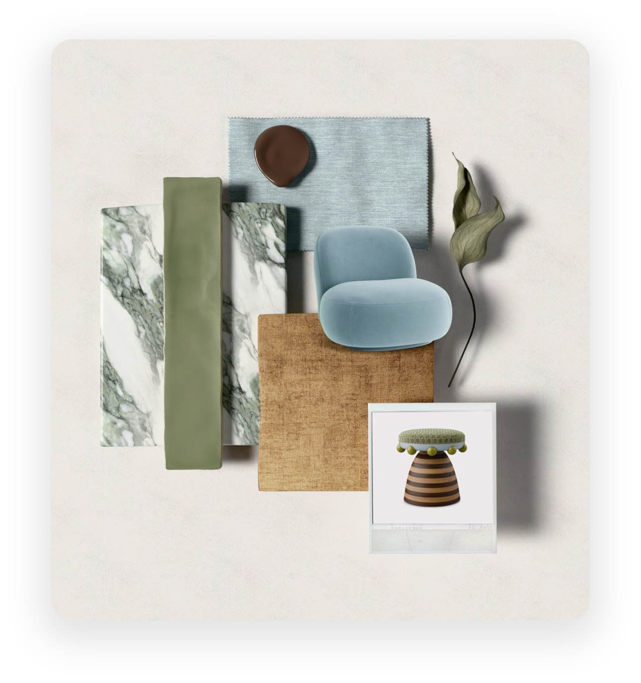
Before MattoBoard, Iokasti worked much more traditionally, collecting references, cutting out products, creating flat compositions and using physical samples whenever possible.
She still values that process. Nothing replaces touching a real material.
What has changed is how early she can reach a convincing direction, and how easily she can question it.
That second point may be more important than speed.
When a board has taken hours to assemble manually, it is easy to become attached to it simply because of the work already invested.
When materials can be moved, swapped or resized quickly, the designer can stay more objective.
Is this actually working?
Or am I protecting the work I have already done?
For Iokasti, that flexibility creates more freedom to experiment, while also helping clients understand material combinations that might otherwise feel abstract as a collection of loose samples or product images.
Perhaps the clearest explanation of Iokasti’s relationship with MattoBoard is also the simplest.
“It gives an idea enough reality for you to properly question it.”
A combination of stone, timber and fabric can sound right in your head.
Once it has depth, texture, proportion and shadow, you can judge it more honestly.
That is where MattoBoard sits within Iokasti’s process. Not as a replacement for physical samples, editorial instinct or the designer’s eye, but as a bridge between intuition and communication.
The authorship still comes from what the designer selects, what they combine, what they question and, often most importantly, what they remove.
Because a successful mood board is not simply there to make an idea look finished.
Sometimes its most useful job is helping you realise that the idea is not finished yet.
Discover more of Iokasti’s work
Turn ideas into client ready concepts with MattoBoard. Start designing today.