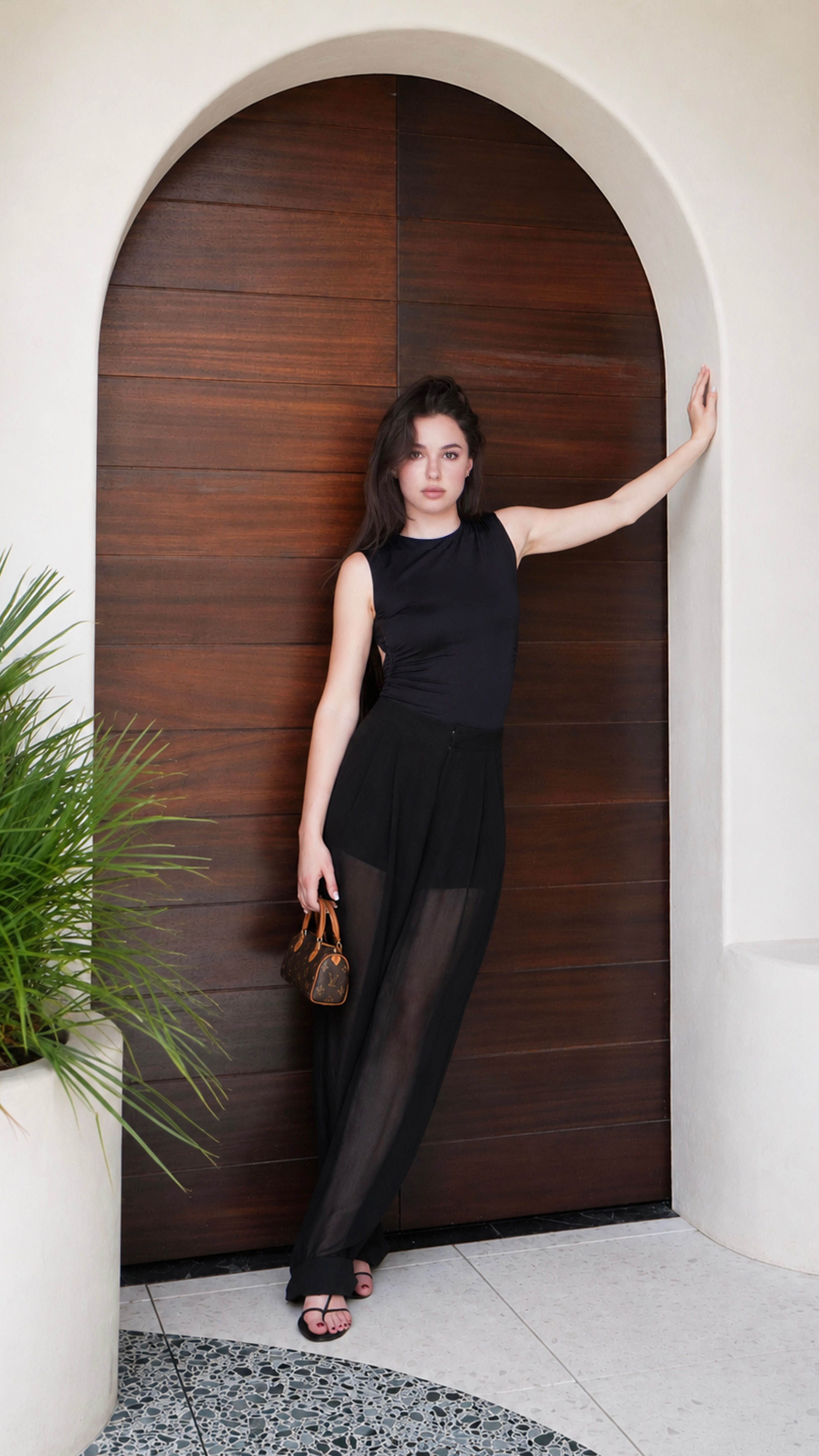
How an Echospace interior designer uses spatial thinking, material storytelling and MattoBoard to turn commercial briefs into clear, confident design decisions.
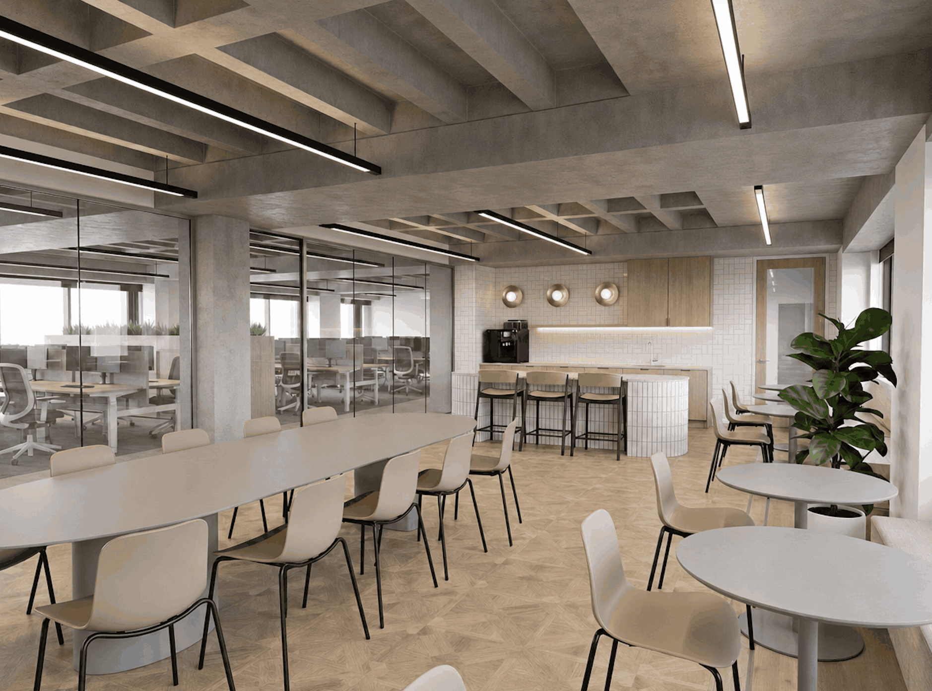
Commercial workplace design has a particular challenge: A space has to look considered, but it also has to work hard.
It needs to support focus and collaboration, reflect a company’s identity, withstand daily use, fit a budget and, often, persuade multiple stakeholders that the direction is right before anything has been built.
For Kasia, interior designer at Echospace, that balance between creativity and practicality has shaped almost every stage of her career.

Kasia began with Interior Architecture, moved into 3D visualization and eventually found her way into workplace design. Each chapter added something different to the way she thinks today: college gave her a foundation in space and proportion, visualization developed her understanding of how people move through a room, and workplace design brought those skills into the realities of delivering projects on site.
Now, she naturally thinks in three dimensions.
Even when looking at a plan, she is already imagining the views through the space, how elements will sit together and how the design will eventually be communicated to somebody who cannot yet see it.
And increasingly, MattoBoard has become part of that communication.
A move into commercial interiors was not originally part of the plan.
Residential design had always appealed to Kasia because of its personal nature, particularly the relationship between people and the spaces they spend time in. But once she moved into workplace design, she found that same human connection on a much larger scale.
Instead of designing around one household, she was thinking about whole teams.
Different personalities. Different working styles. Different needs for privacy, collaboration, flexibility and comfort.
That human focus is what sits underneath the commercial brief.
When a new project arrives at Echospace, the visual direction is not the first conversation.
Listening is.
Before choosing finishes or furniture, Kasia wants to understand how the client operates. What is missing from their current workplace? How do teams interact? Where is privacy important? How often do people collaborate? Who visits the space? How might the business grow?
At the same time, the building itself has its own set of demands, from natural light and circulation to services and physical constraints. Those two pieces of information, the people and the place, shape the brief before the aesthetic begins to emerge.
For commercial designers, that distinction matters.
A successful workplace concept cannot simply be imposed on a floor plan.
It has to grow out of the behaviour the space needs to support.
That same thinking applies to brand identity.
Rather than immediately reaching for a company’s logo colors, Kasia looks at the character of the business itself.
Is the company formal or relaxed? Does its culture revolve around quiet concentration, constant collaboration, or a mixture of the two?
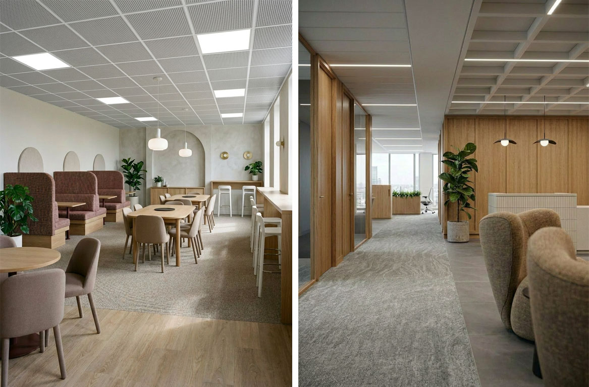
Those qualities can then filter into the interior through color, material, texture, form and detail.
The aim is for the space to feel unmistakably connected to the business without turning every surface into a literal brand reference.
It is a useful lesson for workplace interiors.
Sometimes the strongest brand expression is not the most obvious one.
Commercial design also comes with a reality that mood boards do not always reveal.
Materials need to survive. Furniture needs to perform. Budgets need to hold. Programmes need to be achievable.
Rather than treating those as limitations introduced later, Kasia considers them part of the creative process from the beginning. A finish might be visually perfect, but it still has to suit its location, withstand daily use and earn its place within the budget.
That balance shapes the brands she returns to, from furniture by NORR11, &Tradition and Muuto, to lighting from Industville and Muuto, and performance fabrics from Gabriele, Kvadrat and Camira. The common thread is finding pieces that bring character to a scheme while still standing up to the realities of a commercial environment.
Investment is focused where it will make the greatest impact, while simpler solutions can do the work elsewhere.
That is often where strong commercial design becomes less about choosing the most beautiful option and more about choosing the right one.
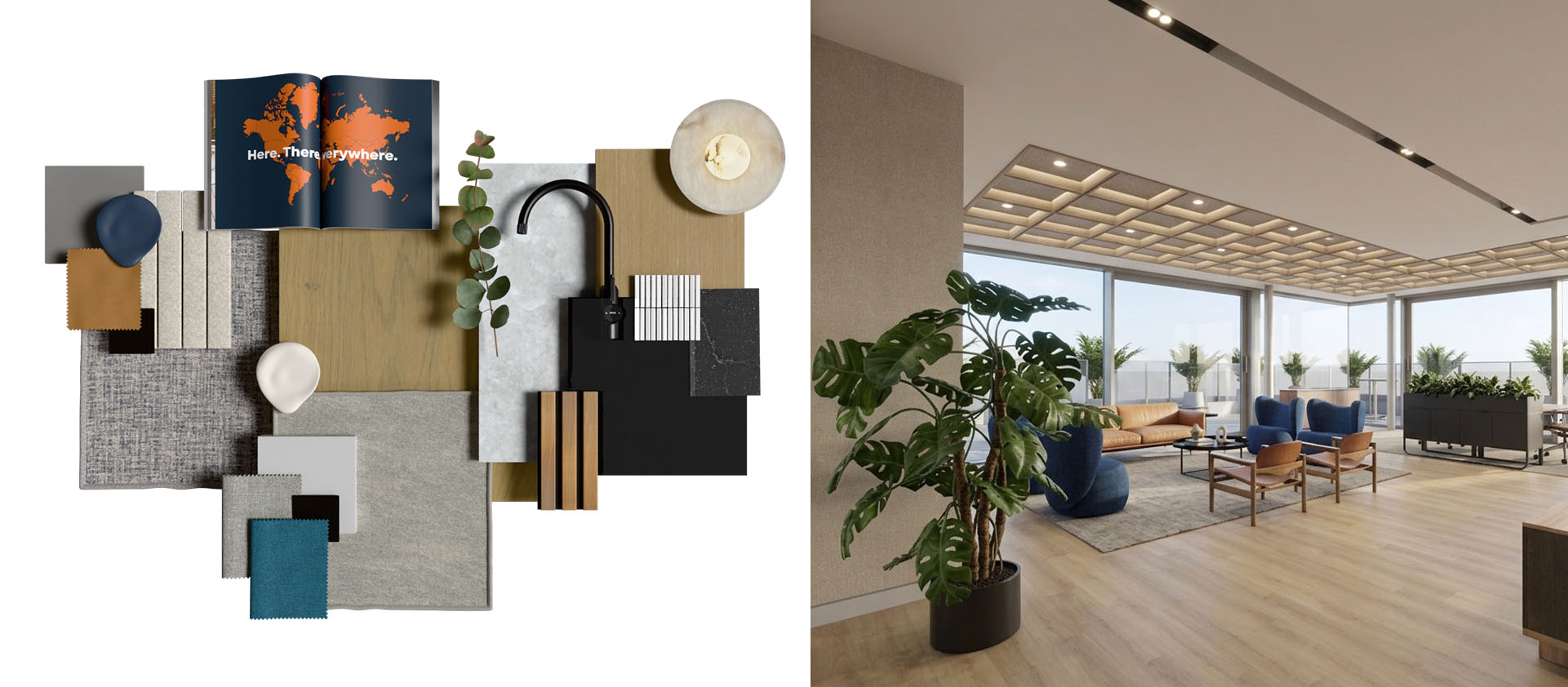
Material boards play a different role.
That feeling comes from relationships.
Not simply whether an individual timber, fabric or metal looks good, but whether they make sense together.
Kasia pays attention to undertones, texture, scale and the balance between hard and soft surfaces. A timber finish needs to sit comfortably beside the upholstery, flooring and metalwork. Visual hierarchy matters too. Some elements can carry the room, while others need to sit quietly in the background.
That makes the material board less of a catalogue and more of a test.
Does every finish have a role?
Is there enough contrast?
Is there too much competition for attention?
Does the palette actually support the atmosphere established in the brief?
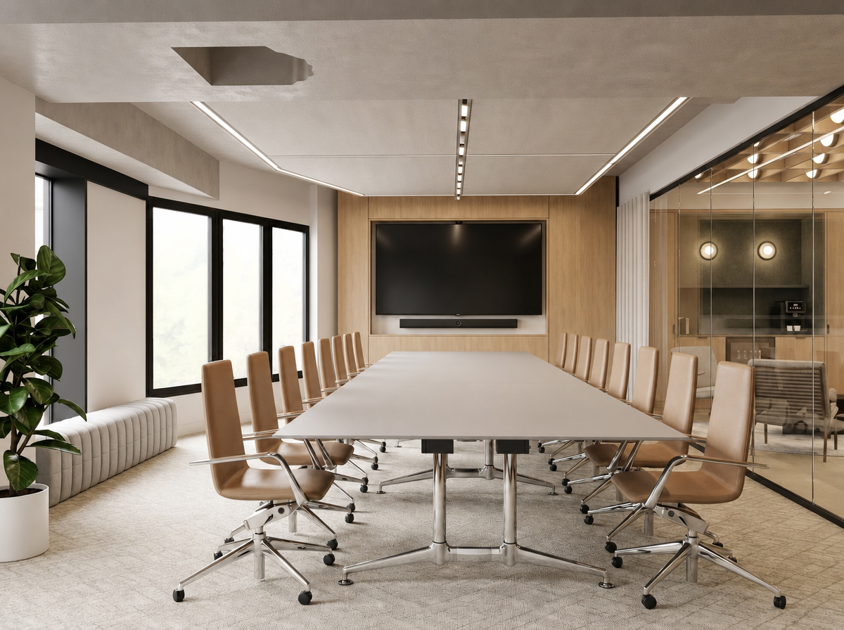
When presenting choices to clients, more is not always better.
Kasia’s preference is to show a small number of considered directions and clearly explain what each one brings to the palette.
Too many options can make a decision harder rather than easier.
Visualization helps bridge that gap because clients can see a finish or piece of furniture in context, rather than judging it as an isolated sample. Physical samples still remain important before approval, particularly for checking true color, texture and quality, but the visual stage helps clients understand the relationship first.
It creates a useful sequence:
Narrow the possibilities.
Visualise the differences.
Then validate them physically.
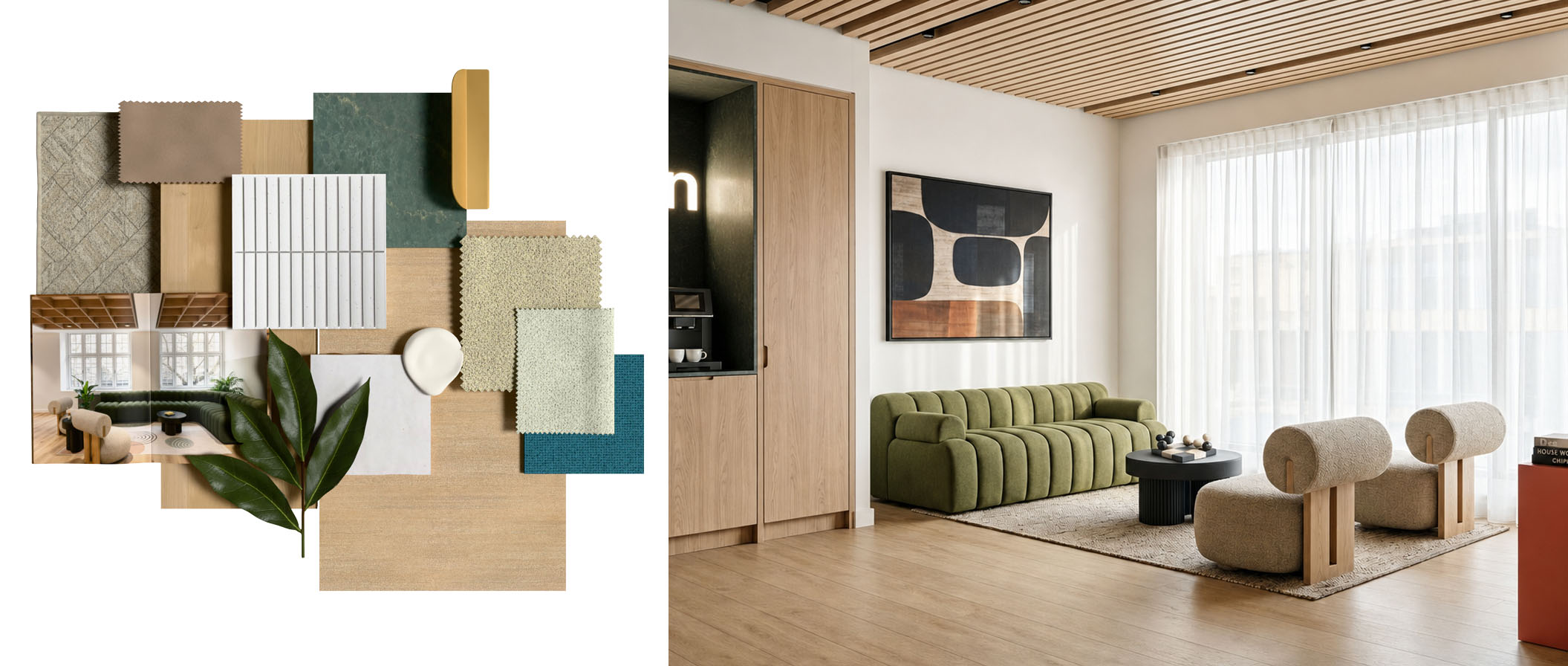
Kasia first discovered MattoBoard through Instagram and was drawn to the way it made material palettes feel more expressive than a conventional grid of flat swatches.
Her workflow typically begins elsewhere.
A SketchUp model is built first to understand the layout, flow, functionality and proportions of the space. Color can be tested there too.
Once the spatial scheme feels resolved, MattoBoard becomes a place to bring the finishes together for client presentation.
Materials and textures can be assembled into a more focused palette, while alternative color directions can be explored without disrupting the wider design.
That is particularly important because color is subjective.
Two clients can look at the same shade and have completely different reactions.
Showing those possibilities visually gives the conversation somewhere concrete to begin.
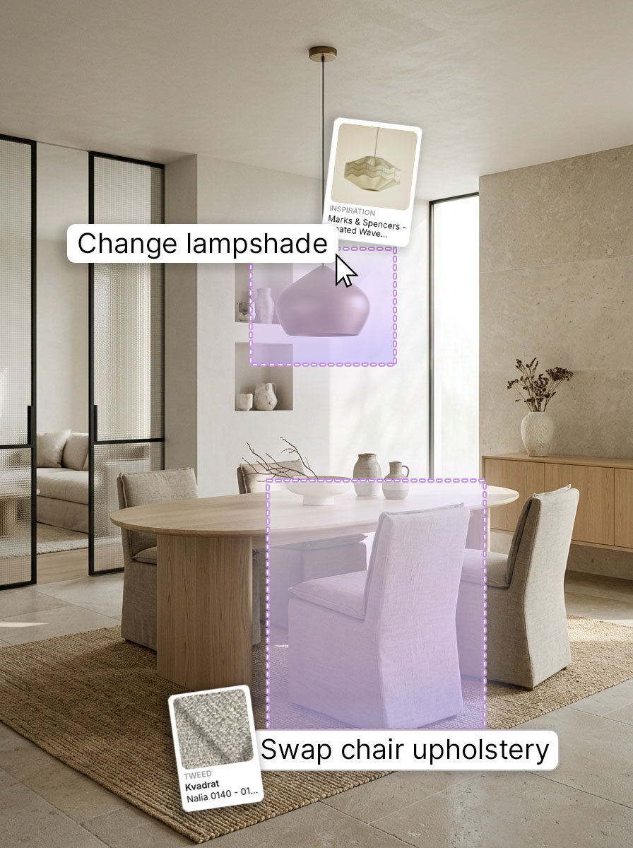
As MattoBoard’s concept tools have developed, its position in her workflow has started to move earlier.
Rather than waiting until the material direction is largely resolved, she can now use MattoBoard’s Image Editor while the atmosphere of the space is still being explored.
Ideas can be tested quickly before being reviewed against the actual building, project brief and specified materials as the design becomes more developed.
That distinction is important.
The AI visual does not become the design.
It becomes something to react to.
A question.
A possibility.
A faster way of asking, “What would happen if we tried this?”
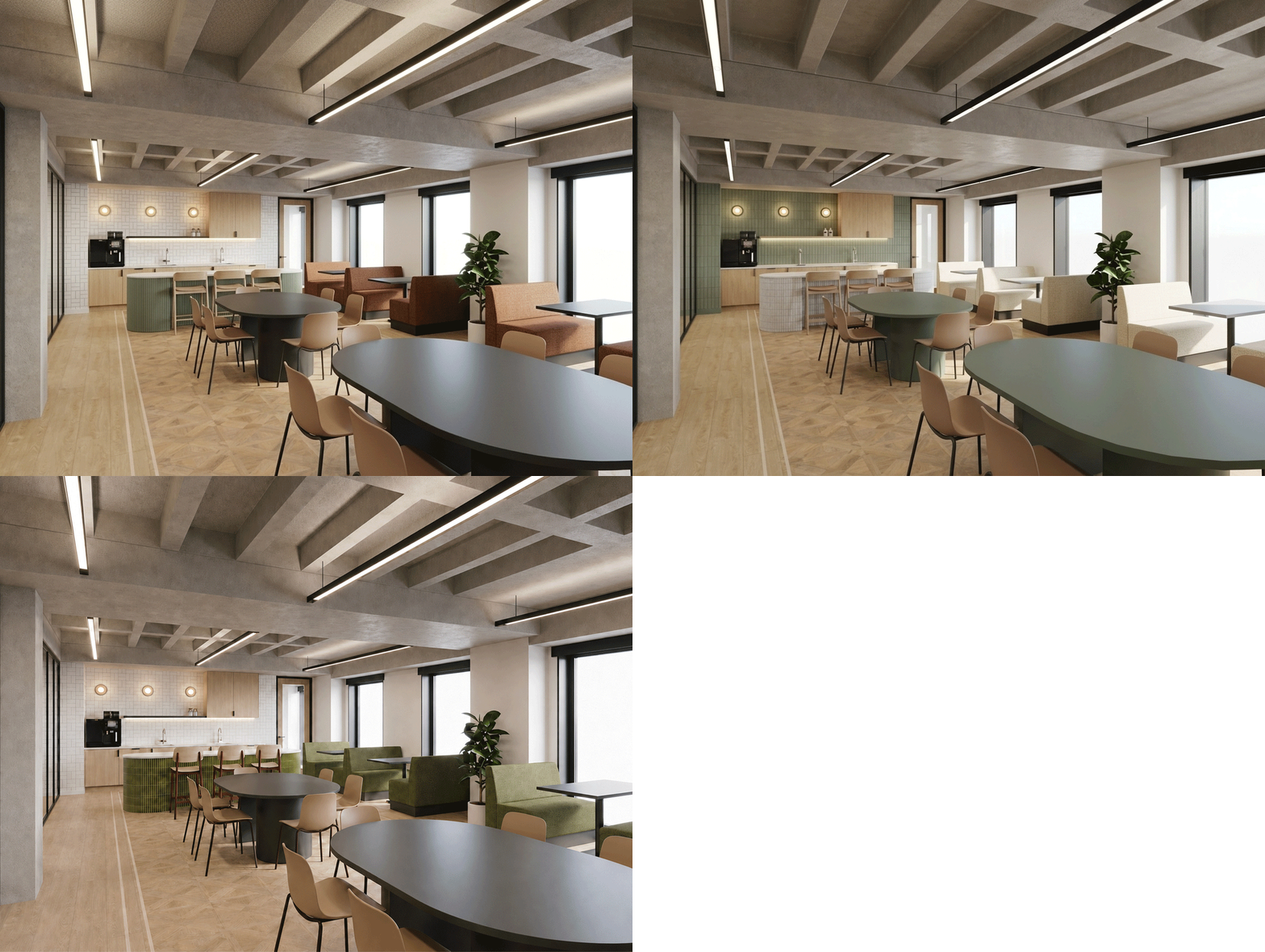
In one of Kasia’s recent projects, the client wanted to introduce subtle color into a breakout space but was struggling to understand how much color was enough and how it should sit alongside the rest of the palette.
The problem was not a lack of options.
It was that the proportions were difficult to communicate through conversation alone.
Using MattoBoard, Kasia created three different directions within around five minutes.
Suddenly, the client could compare them.
Rather than discussing color in abstract terms, they could see what changed when the balance shifted and understand which amount felt right for the room. The options helped resolve a decision that had previously been difficult to explain verbally.
That is where visualization becomes particularly valuable in a client meeting.
Not because it creates more options.
Because it makes the differences between those options easier to understand.
Asked what MattoBoard has changed most about her process, Kasia comes back to speed, but not simply speed for its own sake.
MattoBoard allows her to bring a design direction together quickly, assess whether the palette feels cohesive and communicate the idea before investing more time developing it.
For commercial interiors, that can have an impact far beyond presentation.
A clearer visual can make a client meeting more focused.
A faster comparison can prevent a design decision from becoming stuck.
A material board can help somebody understand not only what has been chosen, but how those decisions work together.
And in workplace design, where every concept has to move between creativity, people, budgets, buildings and approvals, clarity is part of the design process itself.
The strongest tools are not necessarily the ones that add more to that process.
Sometimes, they are the ones that make it easier for everyone involved to see what the designer already has in mind.
Start designing now at Mattoboard.com