A sharp hit of citrus lime is redefining interiors in 2026, moving from small accents to full, immersive spaces. From lacquered furniture to colour-drenched rooms, this bold yellow-green proves it can be both energising and surprisingly liveable when used with intent.
“Citrus lime is not a color for the timid - but in the hands of a confident designer, it is one of the most energising, optimistic, and surprisingly liveable shades in the entire spectrum.”
It arrives in interiors with the force of a season changing. Citrus lime - that electric intersection of yellow and green, sitting somewhere between nature and neon - has become the color story of 2026. Not as an accent, not as a cushion or a candle, but as a full, immersive commitment: on ceilings, across joinery, wrapped around entire rooms. It is a colour that demands to be taken seriously, and interiors are finally doing exactly that.
Lime and chartreuse have always existed at the edge of what is considered acceptable in interiors - too bright to be neutral, too complex to be simple, too alive to be ignored. Their history in design is one of recurring reinvention, each generation discovering the color anew and deploying it with the confidence of someone who believes they are the first to see its potential.
“Chartreuse takes its name from the French liquéur produced by Carthusian monks since the 1700s - a colour so distinctive, so charged with energy, that no other word has ever quite described it.”
In the 18th century, yellow-greens appeared in the gilded salons of Rococo Europe - paler, more acidic versions used to animate plasterwork and contrast with the deep golds and crimsons fashionable at the time. The color carried a sense of vitality and freshness that more sombre tones could not provide, and it found particular favour in garden rooms and orangeries, where it reinforced the connection between interior and the natural world beyond the glass.
The 20th century gave citrus its most defining moments. The Space Age interiors of the 1960s and early 70s - driven by designers like Verner Panton and Olivier Mourgue - embraced acid yellow-greens as part of a broader chromatic revolution that rejected the beige restraint of postwar domesticity. These were rooms that understood colour as energy, as optimism, as a genuinely political statement about the future.
The 1980s brought a brasher, less refined version of the trend - lime green as novelty, as shock value, as part of the decade’s love of chromatic excess. The inevitable backlash that followed consigned citrus tones to the colour equivalent of exile for much of the 1990s and 2000s, as minimalism and the rise of greige interiors made bold colour of any kind deeply unfashionable.
But color, like all things in design, moves in cycles. The post-pandemic desire for joy, optimism, and homes that actively lifted the mood created the conditions for citrus lime’s most sophisticated comeback yet. In 2026, the colour has returned not as novelty or nostalgia, but as genuine design conviction - applied with precision, layered with craft, and paired with materials that give it depth, warmth, and longevity.
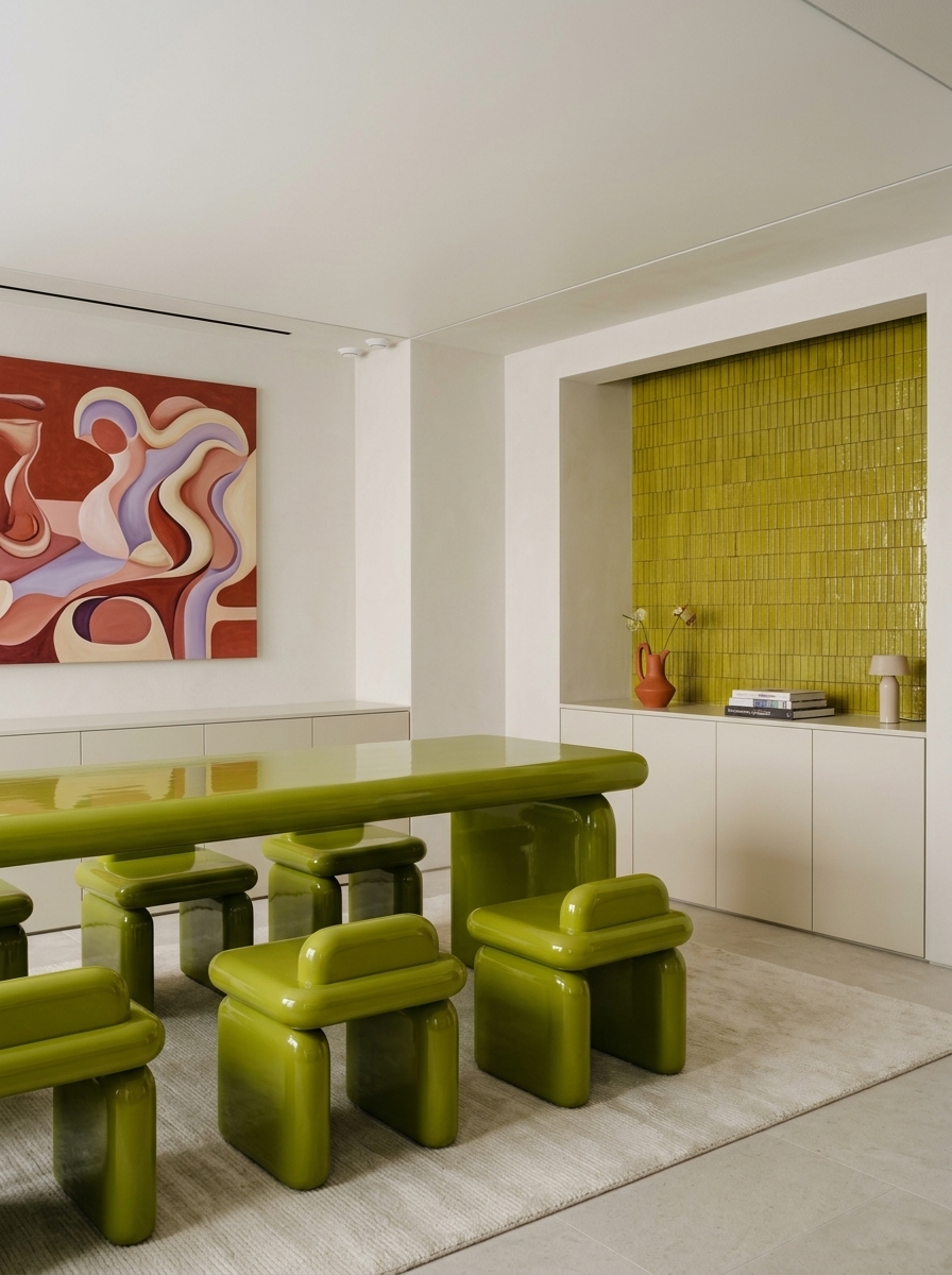
This dining room opens the conversation with maximum visual confidence. A long, low table and a run of matching stools - all in deep, glossy olive-lime - fill the room with the kind of presence usually reserved for sculpture. The furniture’s lacquered finish catches and reflects light in a way that makes the colour feel dimensional rather than flat, shifting subtly between yellow-green and dark chartreuse depending on where you stand.
The room’s genius is what surrounds this centrepiece. White walls with the barest hint of architecture, a clean grey floor, and a single exuberant abstract painting in red and pink that picks up the lime’s warm undertones without matching them. The result is a room that feels simultaneously retro-futurist and completely contemporary - a quality that citrus lime achieves more reliably than almost any other colour.
The matte backdrop against gloss furniture is a pivotal decision here. Had the walls been painted the same lime, the effect would read as overwhelming. By keeping them white, the designer has created contrast that makes the colour genuinely sing - and has given the room visual breathing room that transforms it from a bold experiment into a genuinely liveable space.
Design tip: Gloss-lacquered lime furniture against white walls is the most controlled way to introduce the color - maximum impact, zero overwhelm.
.jpg)
If the dining room uses lime with restraint, this home office uses it with total conviction. Walls, ceiling, built-in joinery, and shelving - all lacquered in the same sharp, electric lime. A deep olive velvet armchair sits at its centre like a deliberate anchor, its matte texture absorbing the light that the high-gloss surfaces around it are busy reflecting.
Color drenching - the practice of applying a single colour across all surfaces of a room, including the ceiling - is one of the definitive interior techniques of the mid-2020s, and this space demonstrates exactly why lime is so well-suited to it. The colour’s natural luminosity means a lime-drenched room never feels dark or heavy, even when the colour is applied at full saturation. The room glows rather than oppresses.
The warm timber desk surface is essential here - it provides the one material that reads differently from the lime, giving the eye a resting point and preventing the space from feeling relentlessly uniform. The chrome table lamp adds a flash of silver that sharpens the yellow-green and gives the room an edge it would otherwise lack.
Design tip: When color drenching with lime, add one warm timber or natural wood surface to prevent the room from reading as cold or clinical.
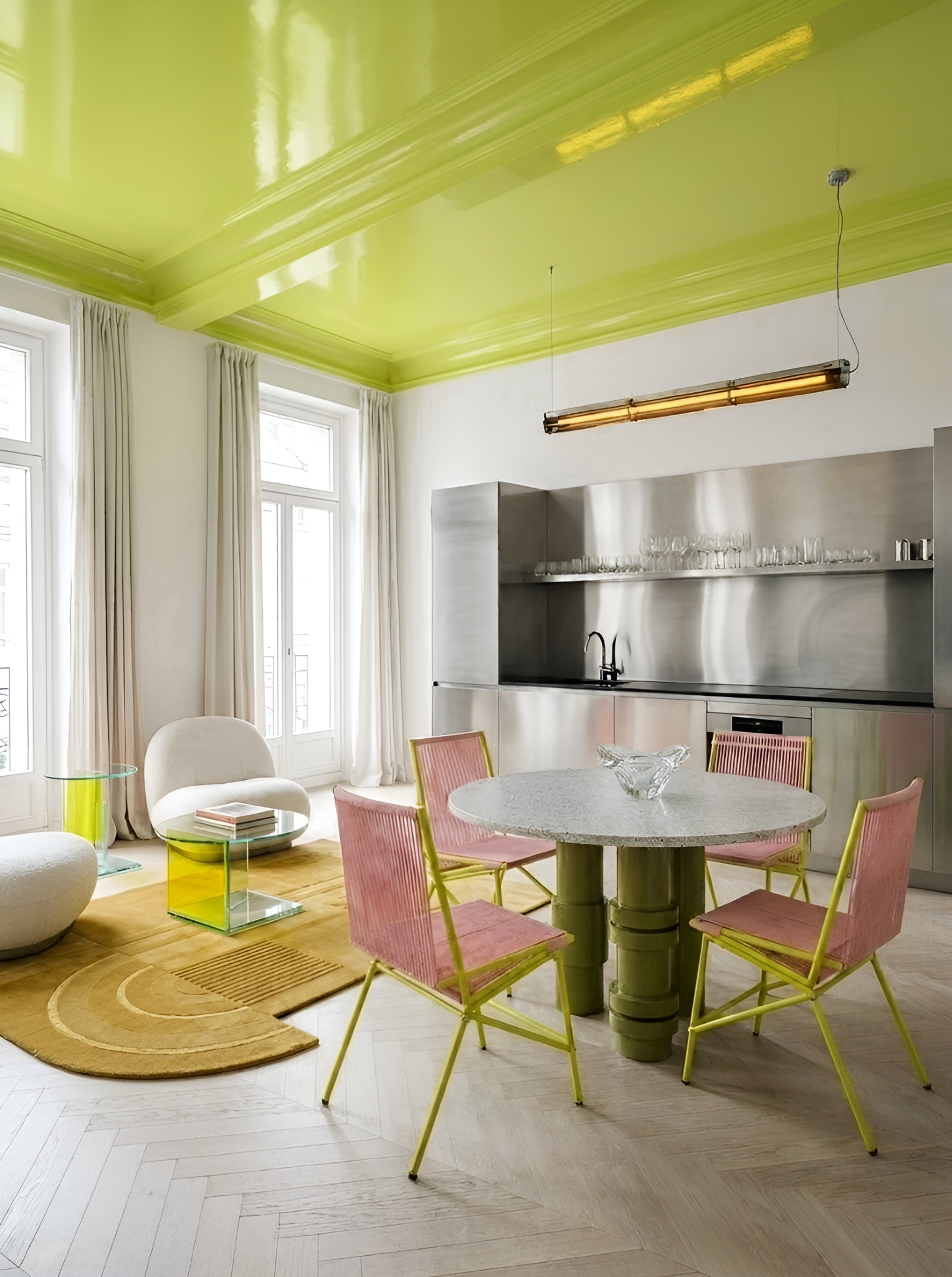
This is citrus lime’s most theatrical application - and its most quietly radical. A high-ceilinged apartment, dressed in crisp white walls, warm herringbone parquet, and a composed mix of pink rattan dining chairs and sculptural marble furniture, is transformed entirely by a single decision: the ceiling, painted in high-gloss lime and left to flood the room with reflected colour.
A lime ceiling does something that no other surface treatment quite achieves: it bathes everything below it in a warm, electric light that shifts as the day progresses. In morning sunlight, the room glows with citrus clarity; in evening artificial light, the ceiling becomes a rich, almost golden canopy. The stainless steel kitchen behind becomes a mirror for the colour, amplifying it across the room.
The painted ceiling is interior design’s most powerful and most underused move - and in lime, it becomes something genuinely transformative. This space answers searches for “painted ceiling ideas,” “statement ceiling color,” and “how to use lime green in an open plan space” with authority.
Design tip: A high-gloss lime ceiling reflects color into the room all day - pair it with white walls and pale floors to let it perform at its full potential.
.jpg)
The most resolved space of the four - and the one that makes the strongest case for citrus lime as a serious, long-term design choice rather than a passing trend. A full open-plan kitchen and dining space, entirely wrapped in lacquered lime joinery from floor to ceiling, with ribbed cabinetry doors that add tactile depth to the colour’s already complex surface. The ceiling continues the lime above, making the room feel like a single, unified object rather than a collection of surfaces.
What prevents this from becoming overwhelming is the ground: a pale, mottled terrazzo-style floor that reads almost as a neutral, its soft organic patterning providing visual rest beneath the colour saturation above. The natural timber dining table and pale upholstered dining chairs offer warmth and contrast without interrupting the room’s fundamental chromatic logic. Red pendant lamps add a jolt of complementary color - red and green sit opposite each other on the color wheel, and their pairing here creates the kind of visual tension that makes a room feel genuinely alive.
The ribbed joinery detail is worth singling out: texture within a single color is one of the most sophisticated moves in contemporary kitchen design, and in lime it is particularly effective. The ribs create shadow and depth that prevent the colour from reading as flat, and they give the joinery a materiality - a sense that it has been crafted, not simply painted. This is lime at its most mature and most compelling.
Design tip: Ribbed or textured cabinet doors in a bold colour add depth and craft — the shadow play within the color prevents it from ever reading as flat or overwhelming.
Lime works best either fully drenched across all surfaces, or as a single bold piece against white. The half-measure - a lime wall among painted neutrals - rarely lands with conviction.
High-gloss lime surfaces reflect light and intensify the color’s energy. Matte lime reads warmer and more organic. Use gloss on architectural surfaces, matte on soft furnishings.
A lime ceiling transforms a room without touching the walls. It bathes the space in color from above, creating an immersive effect that feels both surprising and completely considered.
Natural wood - oak, walnut, pine - balances citrus lime’s sharpness with warmth and organicism. It is the material pairing that prevents lime from feeling clinical or cold.
Red and green sit opposite each other on the color wheel. A red pendant, artwork, or accessory in a lime room creates the kind of visual tension that makes a space feel genuinely dynamic.
Pale stone, terrazzo, or light timber floors give the eye a visual rest beneath the colour saturation. Dark floors compete; pale floors surrender the stage entirely to the lime above.
Citrus lime is a color that asks something of you. It demands that you trust it, commit to it, and resist the instinct to pull back at the last moment and add a beige cushion to “balance” it out. The spaces featured here prove that when you give it that trust - when you lacquer the ceiling, drench the joinery, or place a fully lime dining set into a white room with full conviction - it repays you generously.
There is something genuinely optimistic about the rise of citrus lime in interiors. It is a colour that does not equivocate, does not apologise, and does not hedge. In a design landscape that has spent years defaulting to safety, the lime interior is a small, joyful act of courage - and in 2025, that courage is very much in season.
Whether you begin with a single lacquered chair or go all-in on a kitchen full of ribbed lime cabinetry, the principle is the same: choose the colour because you mean it. The rooms that do are the ones that last.
Create your own lime green interior fantasy at MattoBoard.com
.png)