In this blog post, we'll discuss the meanings behind some of the most popular colors used in design, and give you some tips on how to include them in your mood board and creative workflow. So whether you're looking for a way to brighten up your next project or just want to understand what that pink wall is doing to your emotions, keep reading!

Though the importance of color is often underestimated, it can play a big role in our moods and emotions. In fact, different colors can evoke different feelings and emotions, which is why it's important to understand the psychology of color. By understanding how different colors make us feel, we can start incorporating them into our mood boards in order to create the desired effect.

Color psychology is the study of how colour can affect moods and emotions. It can be used in the creative process to evoke certain feelings in order to create the desired effect. For example, if you are trying to create a calming atmosphere, you might use soft pastels or muted colours. Conversely, if you are going for a more energetic feel, you might use brighter colors.

When creating a mood board, it can be helpful to keep color psychology in mind. This will allow you to choose colors that will help create the overall mood or feeling that you are going for. For example, if you are trying to create a board that is full of ideas for a summer party, you might want to use brighter, warmer colors to help evoke that feeling.
Once you understand the basics of color psychology, you can start incorporating different colors into your mood board. Just remember to experiment and have fun with it – there are no wrong answers when it comes to using color in your creative process!
When it comes to using color in your mood board, there are a few key benefits to keep in mind. First, using color can help to create a specific mood or feeling that you want to evoke in your audience. Different colors can be associated with different emotions, so it's important to be aware of which shades you're using and what message you want to communicate.

Second, color can also be used to add visual interest to your mood board. If you're working with a lot of text or other elements that might be considered boring, adding in some pops of color can help to liven things up and make your mood board more visually appealing.
Finally, using color can also help you to organize your mood board in a way that makes sense for your project. For example, if you're working on a project with multiple parts, you might want to use different colors to represent each part. This can help you keep track of everything and ensure that you're using the right colors in the right places.
Keep these benefits in mind as you start incorporating color into your mood board and creative process. With a little bit of planning, you can use color to great effect and create a mood board that's both visually appealing and informative.
When it comes to using color in your mood board, it's crucial to use the right hues in order to create the desired effect. To help you understand the power of color and its effects, we've added some descriptions below!

If you're looking to create a calming and relaxing environment, you might want to use colors like blue and green. These shades are often associated with tranquillity and peace, so they can be great for creating a relaxing atmosphere. Alternatively, if you're looking to create a more energetic and vibrant space, you might want to use colors like yellow and orange. These colors are often associated with happiness and excitement, so they can help to inject some energy into your mood board.

Once you know which colors you want to use, you can start incorporating them into your mood board. Experiment with different combinations and placements until you find a color scheme that you're happy with. Then, use those colors as a starting point for your creative process.

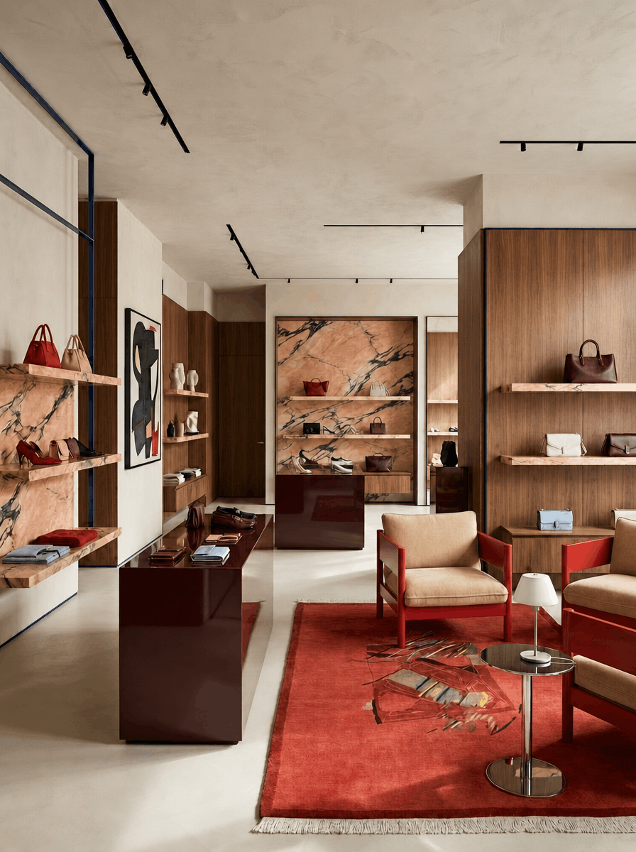
Red is often associated with passion, love, and anger. It's also a very powerful and commanding color, which is why it's often used in advertising. If you want to create a mood board that evokes strong emotions, then consider using red. However, be careful not to use too much red, as it can be overwhelming.

Orange is often associated with happiness, energy, and excitement. It's also a very warm color, which makes it perfect for summertime mood boards. If you want to create a cheerful and upbeat mood board, then consider using orange as the centrepiece shade.

Yellow is often associated with happiness, optimism, and sunshine. It's also a very cheerful color, which makes it perfect for summertime mood boards. If you want to create a happy and positive mood board, then yellow will be your best friend!

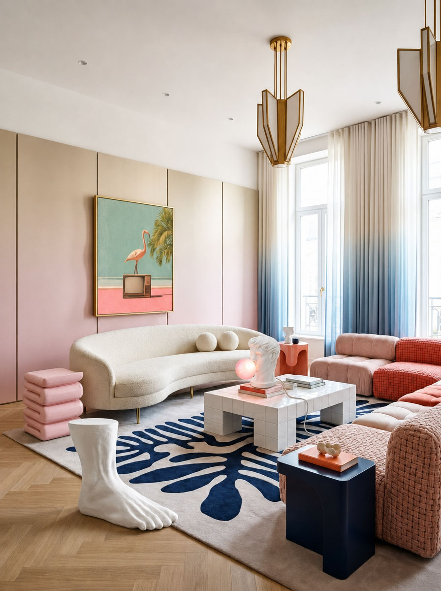
Green is often associated with nature, growth, and new beginnings. It's also a very calming and refreshing color, which makes it perfect for springtime mood boards. If you want to create a peaceful and serene mood board, then consider using green for its healing and restful properties.

Blue is often associated with calmness, peace, and serenity. It's also a very relaxed and tranquil color, which makes it perfect for summertime mood boards. If you want to create a calming and serene mood board, then use blue as the stand out color.

Purple is often associated with royalty, mystery, and magic. It's also a very luxurious and regal color, which makes it perfect for fall/winter mood boards. If you want to create a mood board that is both luxurious and mysterious, then consider using purple as one of your main colors.
If you are using Mattoboard for creating inspirational mood boards and interior material boards you can search and filter by color.
Adding color to your creative process can be a fun and effective way of enhancing it. By understanding the psychology of colors, you can select hues that will help you achieve the desired mood or feeling for your project. Whether you're working on a mood board, interior design concept, material board for a room or spatial design, visual merchandising, an advertising campaign, or just want some new ideas for your personal art journal, using colours to influence your creative process can be a great way to get started.
Mattoboard is a 3D tool for designers. Our drag and drop technology helps you design quickly & experiment endlessly. Stay on trend and use visual storytelling to create mood and material boards.
.png)